Color wheel
Find the perfect color palette for your project in seconds.
Working with industry leaders
We’re a proud partner of these globally recognized brands.
Find perfect color combinations
Create balanced color palettes using color theory to enhance branding, design, UI, and creative projects, with no artistic expertise required.
How to use Quillbot’s color wheel
Choose your base color
Select a color harmony
See the results
Introduction to color theory
Understanding color relationships helps you create more appealing and effective designs. The color wheel generator lets you effortlessly explore these key harmony types:
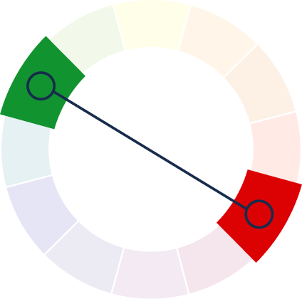
Complementary colors
Opposite colors create bold contrast and strong visual impact.
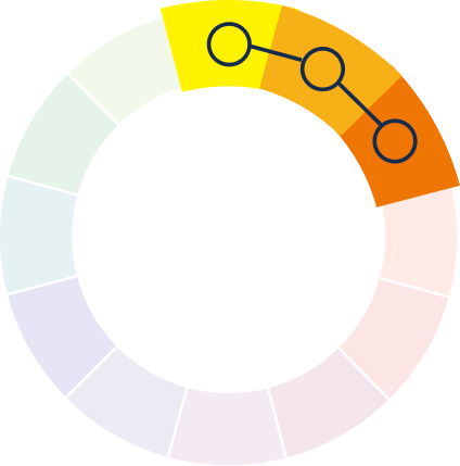
Analogous colors
Neighboring colors offer smooth, natural-looking designs.
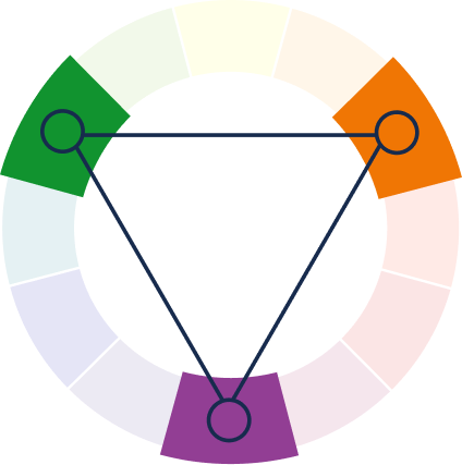
Triadic colors
Three colors, evenly spaced on the wheel offer contrast.
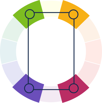
Tetradic colors
Two complementary pairs provide cohesive, bold color stories.
Understanding primary, secondary, and tertiary colors
Learn how colors relate, interact, and build upon one another to form the full spectrum we see and use in art and design.
Primary colors
These are the core colors—red, blue, and yellow—which cannot be created by mixing other colors.
Secondary colors
These are created by mixing two primary colors, resulting in green, orange, and purple.
Tertiary colors
These are formed by mixing a primary color with a neighboring secondary color, creating shades like red-orange or blue-green.
Who can use Quillbot’s color wheel?
Designers
Build brand kits, UI themes, and visual systems faster.
Content creators
Design eye-catching thumbnails and social content.
Marketers
Create on-brand visuals for ads and campaigns.
Tips for using Quilbot's color wheel
Choose a base brand or project color to guide all palette decisions.
Try different color patterns for balance or contrast.
Test color pairings to ensure readability for text and designs.
Create flexible palettes that work consistently across channels.
Do it all with Quillbot
Get a writing assistant wherever you go


Why writers love us
Quillbot’s color wheel FAQs
What is a color wheel?
A color wheel is a visual tool that organizes colors based on their relationships, helping users understand how different colors interact and combine in design, art, and branding.
How does Quillbot's AI color wheel work?
An AI color wheel analyzes your selected base color and instantly generates harmonious color combinations using built-in rules like complementary, analogous, triadic, and tetradic schemes.
What’s the difference between warm and cool colors?
Warm colors like red, orange, and yellow evoke energy and warmth, while cool colors like blue, green, and purple create calm, balance, and a sense of depth.
Is Quillbot’s color wheel free to use?
Yes, Quillbot’s color wheel is free to use, allowing users to explore color harmonies and build color combinations without any cost.
What color harmony types does the tool support?
Quillbot's color wheel tool offers several widely used color harmony options, including Complementary, Analogous, Triadic, Tetradic, and Square. These harmony types help you quickly find color combinations that look balanced and work well together across different design styles.
Can beginners use the color wheel effectively?
Yes. The color wheel is designed to be intuitive and beginner-friendly, making it easy for anyone to create balanced and visually appealing color combinations.
How can I practically apply the color wheel in my design work?
You can use the color wheel to select matching colors for websites, branding, social media graphics, presentations, and illustrations to ensure consistent and professional visuals.
Can I use the color wheel for brand identity or logo design?
Yes, the color wheel is a powerful tool for building brand color systems, selecting logo color combinations, and ensuring consistent visual identity across all platforms.