What Is Typography? | Definition & Key Terms
If you’ve created a document or presentation, you’ve practiced typography. Put simply, typography is the art of arranging text to be readable and visually appealing. Important considerations include size, spacing, alignment, typeface (or font), and color.
This beginner’s guide to typography will give you the foundational knowledge to create polished, professional documents. And because great design requires more than just great text, QuillBot’s AI Image Generator can help you create bespoke visuals to pair with your perfect typography.
Typography definition
Typography is the art of arranging digital or printed type (letters, numbers, and symbols) in a functional and aesthetic manner. Elements of typography include size, spacing, alignment, typeface (or font), and color. The intentional selection of these elements allows the text to convey meaning and emotion that extends beyond the words themselves.
Typesetting is the procedure of preparing text for print or digital publication. It is an ancient process, dating back to the creation of movable type in China in 1040 AD and Gutenberg’s printing press in the 1400s. Today, it involves selecting a font and determining the physical arrangement of text on a page. Typesetting is generally associated with the text you see in books or newspapers, with emphasis placed on consistency and function. Although aesthetics are also considered, typesetting lacks some of the artistic elements associated with typography—a typographer is like an architect, designing using words; a typesetter is more like a civil engineer, determining how everything fits together.
Type design is the creation of new typefaces, or letter styles (a font is a specific instance of a typeface in a specific style and size). An important part of both typography and typesetting is selecting a typeface that conveys the proper mood and suits the desired function of the text. In our building analogy, the type designer is the materials scientist who develops the fundamental components (bricks, mortar, etc.) that the typesetter and typographer use to realize their vision.
Important typography terms
You’re bound to encounter the following terms as you delve into the world of typography.
Alignment
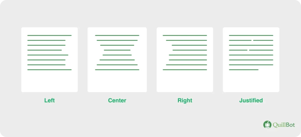
Alignment is how text is positioned within a space such as a page, table cell, or column. Left-aligned text lines up with the left margin, right-aligned text lines up with the right margin, centered text is centered on the page, and justified text is aligned to both the left and right margins.
Different alignment options
Ascender
Ascenders are the parts of some lowercase letters (e.g., “d,” “l”) that rise above the x-height. The ascender height may or may not match the cap height.
Ascenders are the parts of lowercase letters that rise above the x-height

Baseline
The baseline is an invisible horizontal line on which text sits.
The baseline is the invisible line letters rest on

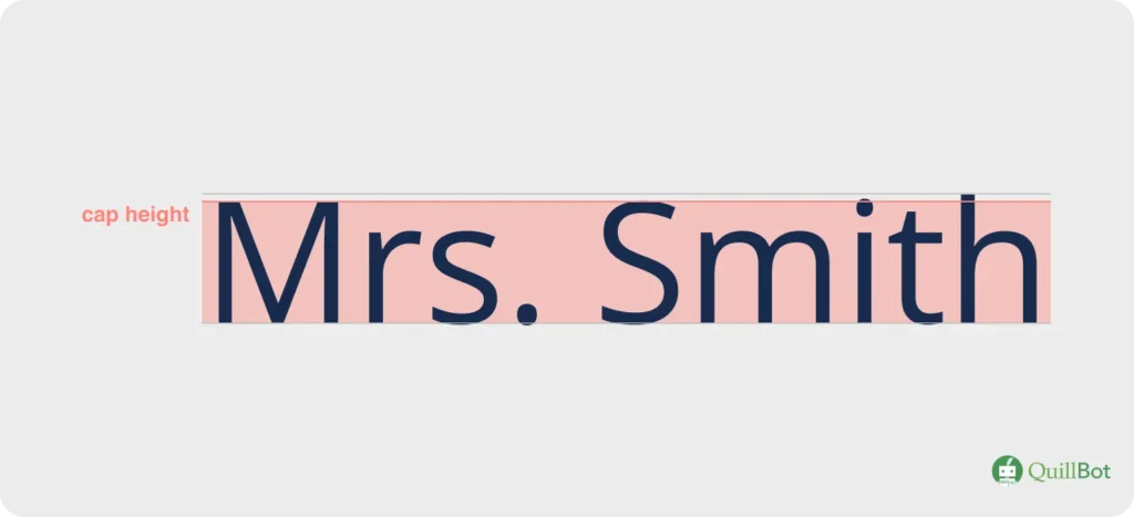
Cap height
Cap height is the height from the baseline to the top of flat capital letters like “N” or “Y.” Capital letters with a rounded top (e.g., “S”) may extend slightly past the cap height to give the illusion that they are the same size.
Cap height is the height from the baseline to the tops of capital letters
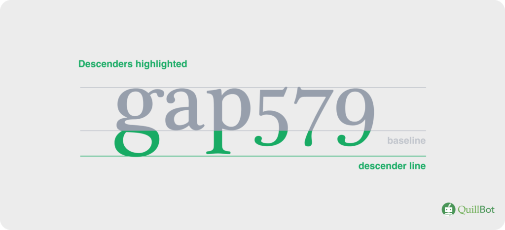
Descenders
Descenders are the parts of lowercase letters (e.g., “y” or “j”) and some old-fashioned number styles that fall below the baseline.
Descenders are the parts of letters and numbers that fall below the baseline
Display typeface
A display typeface (or display font) is meant to be used at large sizes, such as for headlines, logos, and posters. It may not be legible at smaller sizes.
A display font is meant to be used at large sizes

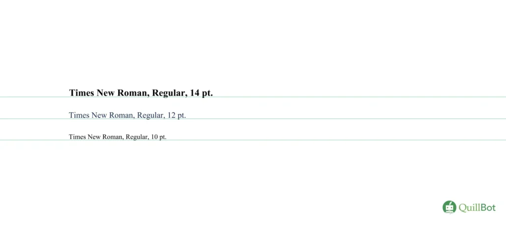
Font
A font is a specific style, weight, and size of a typeface (e.g., Times New Roman, bold, 11 pt.). Some fonts within the Times New Roman typeface are depicted below.
Different Times New Roman fonts
Hierarchy
Hierarchy is the practice of organizing text using elements like size, color, and weight to indicate to the reader what is most important. For example, headings are generally larger and bolder than body text.
Hierarchy is the use of different text styles to guide the reader’s attention

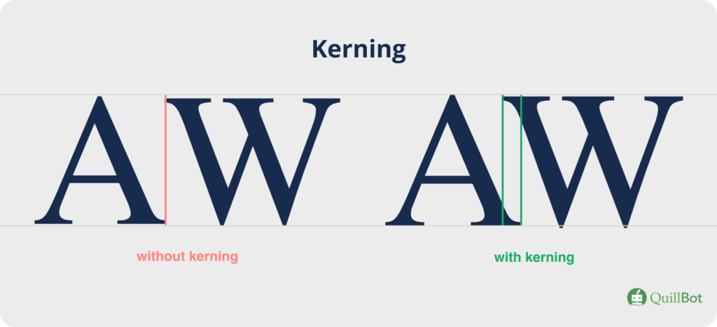
Kerning
Kerning is the space between specific character pairs. Unlike tracking, which applies to all characters, kerning can be adjusted for certain letter pairs; for example, the kerning of “AW” is generally adjusted by shifting the “W” toward the “A” to prevent an awkward gap.
Kerning controls the spacing between specific character pairs
Leading/line height
Leading (rhymes with bedding), or line height, is the vertical space between two lines of text, measured from the one baseline to the next.
Line spacing/leading is the space between the baselines of two adjacent lines of text

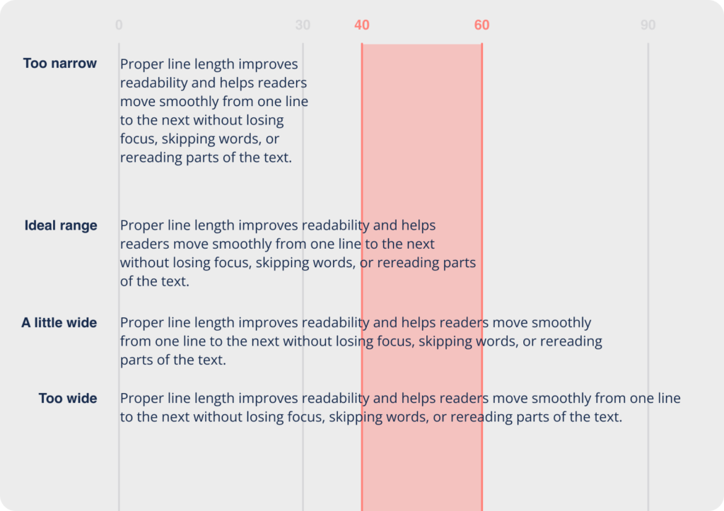
Line length
Line length is an important consideration for blocks of text. The sweet spot is usually 40–60 characters to ensure comfortable reading.
Different line lengths
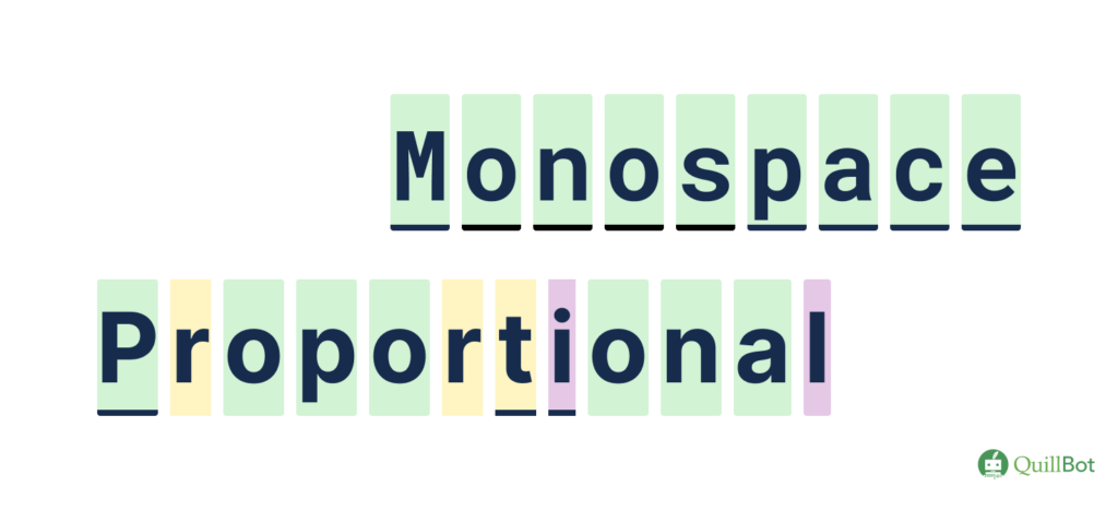
Monospace
In monospace typefaces, all characters have the same width (i.e., take up the same amount of space horizontally). The opposite is proportional typefaces, where narrow characters like “i” take up less space than wider characters like “w.”
Monospace and proportional typeface examples
Script font
A script font (or typeface) mimics handwriting or calligraphy. The strokes may vary in width, and the characters may connect to each other.
A script font

Serif font
A serif typeface (or serif font) has small decorative strokes at the end of each longer stroke. Serif fonts date back to ancient times and convey a sense of tradition and authority.
Serif fonts have “serifs” at the ends of letters; sans-serif fonts do not
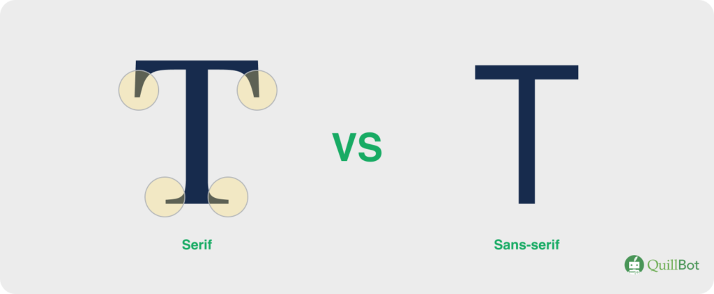
Sans-serif font
Sans-serif fonts (i.e., typefaces) have no decorative strokes at the ends of lines. They appear modern and clean.
Tracking
Tracking, or letter spacing, is the uniform space between all characters. Adjusting tracking will affect the entire block of text, whereas adjusting kerning will impact only a specific character pair.
Tracking changes the overall appearance of text
![]()
Typeface
A typeface is a font family, such as Arial or Times New Roman. All characters of a typeface share a certain style, but their size and weight can be altered to create different fonts.
Sans-serif, serif, and script typefaces

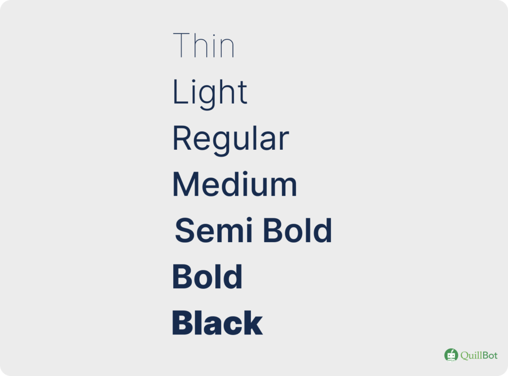
Weight
Weight is the thickness of the strokes used to draw letters. A single typeface will generally have multiple weights that can be used to create different fonts. Common weights include Light, Medium, Bold, and Black.
The weight is the thickness of the lines used to draw letters
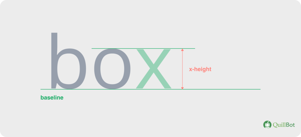
X-height
The x-height is the height of the lowercase letter “x” for a typeface, measured from the baseline, and governs how tall lowercase letters are. Increasing x-height generally improves readability.
X-height is the height of the lowercase letter “x”
Why typography matters
While visual appeal is an important consideration, the benefits of typography transcend simple aesthetics. Using text as an artistic medium, typography allows you to convey meaning that extends beyond the literal definition of words. As you experiment with typography in your next project, carefully consider how your choices align with the following factors.
Readability and user experience
Carefully considered typography removes barriers between reader and information. Think about the needs of your intended audience (e.g., children, professionals, older adults) and the purpose of your content, and always design with these things in mind. Appropriate spacing, effective typeface choices, and organized hierarchy will help your message stand out in a world of information overload.
Branding and identity
When used intentionally and consistently, typography can automatically evoke the essence of your brand. Trying to convey authority or tradition? Use a serif typeface and bold lettering. Whimsy and playfulness? Soft colors and a display font may be the right direction. Carefully considering these design elements and using them consistently can help sustain a brand identity long-term.
Typography best practices
There are entire courses and careers built around typography. However, if you’re just getting started, the following guidelines will give your designs and content a major boost.
- Less is more: As the artist Julia Cameron said, “Clutter is the enemy of clarity.” Before adding elements to your content, consider whether they’re truly necessary. Add negative (empty) space to give your design room to breathe.
- Don’t use too many typefaces: “Less is more” also applies to the number of typefaces or fonts you use. Too many different typefaces can look messy and confusing. “No more than three” is a good rule of thumb.
- Consider typeface pairings carefully: Two typefaces might look great on their own but terrible together. A good practice when pairing typefaces is to pick a serif and a sans serif option; this contrast ensures that the reader can distinguish between them.
- Prioritize readability: Have you ever been in a dimly lit restaurant, struggling to make out the tiny script font on the menu? This is an example of typography gone wrong. As the designer, always put yourself in the position of your reader, being sure to balance aesthetics with readability, considering elements like leading and line length.
- Left-aligned is the easiest to read: When a reader reaches the end of a line of text, their eyes jump (or saccade) to the start of the next line. If text is left-aligned, this starting position is always in the same place, which streamlines reading. Save centered text for headings, and keep multiline blocks of text left-aligned.
- Consider your platform: Text will look vastly different if viewed on a laptop compared to a cellphone. Consider how your text will look on different devices, and test it out to make sure everything scales well.
- Don’t underestimate hierarchy: Perfect hierarchy should go unnoticed; the reader’s eyes should be guided around the page to get information in the order they need it. Consider what will grab their attention and what they need to know next, and choose your design elements like text size and spacing to encourage this behavior.
Frequently asked questions about typography
- What is the definition of tracking in typography?
-
Tracking is a typography term that refers to the space between characters in a block of text. Tracking is consistent for all characters, so changing it will impact the overall appearance of text. Tracking can be adjusted to make text appear more spacious or to help fit text in a tight space.
Tracking is easily confused with kerning, which is the space between specific character pairs. For example, the kerning in the letter pair “AV” is generally adjusted to avoid an awkward gap between these two letters (e.g., “A V”), but this adjustment will not impact the spacing of other letter pairs.
If you need a term broken down in a simple and easy-to-understand way, try QuillBot’s free AI Chat.
- What is the definition of leading in typography?
-
In typography, leading (pronounced “ledd-ing”) is the vertical space between two lines of text, measured from one baseline (the invisible line on which the letters sit) to the next. Leading can be adjusted to improve readability or help make text look cohesive.
Leading gets its name from early typesetting practices: when type was set by hand, typesetters would insert thin strips of lead between lines to achieve the desired spacing.
Visualization is a powerful tool in design. QuillBot’s free AI Image Generator lets you describe your vision and bring it to life with the click of a button.
- What is typography vs font?
-
“Typography” and “font” are related terms but with distinct meanings.
Typography is the arrangement of type (i.e., text). Design elements that fall under the umbrella of typography include color, size, spacing, alignment, and typeface/font.
Font is the design of letters and characters themselves. Any given font has a typeface, style, and size (e.g., Arial Bold 12pt).
Terminology can be confusing. The next time you’re trying to figure out the difference between two related terms, QuillBot’s AI Chat can help break down the differences in a way you can understand.
- What are the four different font types?
-
In typography, font typefaces are generally divided into four main categories:
- Serif: Serif fonts have small decorative strokes capping the ends of longer strokes. They convey authority and credibility.
- Sans-serif: As the name suggests, the strokes in sans-serif fonts are not capped with decorative lines. These fonts have a more modern feel.
- Script: Script fonts mimic handwriting or calligraphy, with flowing lines, connected letters, and varying line width. They convey creativity and personality.
- Display: Display fonts prioritize appearance/impact over readability. They are typically intended for the large text used in titles and logos; at smaller sizes they may not be legible.
QuillBot’s free AI Chat is a great tool for whenever you’re looking for a concise breakdown of any topic.
Cite this QuillBot article
We encourage the use of reliable sources in all types of writing. You can copy and paste the citation or click the "Cite this article" button to automatically add it to our free Citation Generator.
Heffernan, E. (2026, March 11). What Is Typography? | Definition & Key Terms. Quillbot. Retrieved March 30, 2026, from https://quillbot.com/blog/typography-and-fonts/typography-definition/