Branding Design | Principles, Elements & How To
Branding design is the process behind how a brand chooses to represent itself, primarily through visual elements like color, typography, logos, and images. It’s closely related to—but not the same as—other core branding principles like brand identity, visual identity, and brand purpose.

What is branding design?
Branding design is the strategic process of creating and managing a unique, consistent way for a brand to express itself visually across physical and digital spaces. It incorporates primarily visual elements (e.g., logos, colors, and fonts) and emotional elements (e.g., tone of voice) to define how a brand looks, feels, and presents itself across all touchpoints.
Think of branding design as a bridge between business strategy and customer experience. When done correctly, branding design tells a brand’s story and communicates its purpose. It’s not about producing individual assets, but rather building a coherent and cohesive identity system that builds recognition, differentiation, and trust among consumers.
Practically speaking, branding design ensures that every customer interaction—whether with a website, social profile, mobile app, advertisement, or physical product—communicates the same brand message and visual language.
Branding design vs brand identity
Brand identity refers to the overall identity of a brand, including both tangible and intangible elements. This includes the visual components as well as abstract ones such as brand values, personality, mission, and tone.
Branding design is the design-driven component of brand identity. It focuses specifically on translating a brand’s strategic positioning and personality into a visual system that people can see, recognize, and interact with.
In other words:
- Brand identity is all that a brand is.
- Branding design is the system behind how that identity is expressed visually.
Branding design vs visual identity
Visual identity is the set of visual assets a brand uses, such as logos, icons, color palettes, and typography. Branding design is broader. It includes visual identity but also covers how those elements are applied across channels, how they evolve over time, and how they align with brand positioning and audience expectations.
Basically:
- Visual identity is a deliverable.
- Branding design is the system and process that develops that deliverable.
Branding design vs brand strategy
Brand strategy defines a brand’s long-term direction, including its target audience, value proposition, positioning, and competitive differentiation. It’s much wider than just design and includes the brand’s communication style, mission statement, and more.
Branding design is one execution layer of brand strategy. It turns strategic decisions into concrete design systems that can be implemented across real-world platforms.
In short:
- Brand strategy answers “Who are we, what do we do, and what do we stand for?”
- Branding design answers “How do we express that in a memorable way?”
These two are closely intertwined. Without strategy, branding design becomes decorative, and without branding design, brand strategy remains invisible.
Why branding design matters
Branding design plays a central role in how a business is perceived, trusted, and remembered. It directly influences whether potential customers recognize a brand, understand what it offers, and feel confident engaging with it.
Branding design offers:
- Differentiation: In crowded markets, a clear and consistent branding design system helps a business stand out, communicate its positioning, and suggest why it’s the best option.
- Recognition and recall: Repeated exposure to the same visual language makes a brand easier to remember. Over time, this reduces the effort required for customers to identify the brand and increases the likelihood of repeat engagement.
- Trust and credibility: Professional, coherent design conveys legitimacy and competence, especially for new or unfamiliar brands. Inconsistent or poorly executed branding, on the other hand, creates friction and can make even strong products appear unreliable.
- Consistency at scale: A well-defined design system allows different teams, departments, or external partners to confidently produce materials that look and feel aligned. This is especially important for growing businesses that operate across multiple channels—such as websites, social media, email, advertising, packaging, and physical spaces—and brands with distributed teams.
- Long-term brand equity: Strong brands accumulate value—or equity—over time through recognition, emotional association, and perceived quality. Branding design is the mechanism that makes this accumulation possible by ensuring that every interaction reinforces the same identity and message.
Branding design principles
Effective branding design is guided by a set of core principles that determine how the brand system is constructed, documented, and maintained. These principles ensure that branding design functions as a coherent system rather than a collection of disconnected visual assets.
Consistency
Consistency requires that all brand elements be defined in advance and reused according to fixed rules. Design elements should be documented in brand guidelines and applied uniformly, rather than being redesigned or interpreted subjectively for each use case.
Why it matters: This principle prevents fragmentation and makes sure that different designers, teams, or partners produce aligned outputs without altering the brand’s identity.
Clarity
Clarity means that the brand system communicates a single, unambiguous identity. Design elements should be limited in number, logically structured, and easy to apply. Excessive styles, conflicting visual cues, or unnecessary variations introduce noise and make the brand harder to implement consistently.
Why it matters: A clear branding design system reduces cognitive load by giving internal teams clear guidelines to follow and making visual cues easier for customers to recognize and understand.
Differentiation
Differentiation requires that branding design is derived from the brand’s unique positioning rather than generic industry patterns. Visual choices should be intentional and grounded in what distinguishes the brand, not in prevailing trends or competitor aesthetics.
Why it matters: This principle ensures that the brand system expresses a specific identity instead of converging toward standard visual conventions used by competitors.
Scalability
Scalability means the core design elements—such as logos, typography, grids, and layout rules—should function as flexible building blocks rather than fixed compositions. These modular components can then be recombined and extended without breaking the identity.
Why it matters: This allows the brand to expand across new platforms, formats, and contexts without requiring a redesign of the underlying system.
Audience alignment
Audience alignment requires that branding design decisions be informed by the brand’s target users and cultural context. Visual language, tone of voice, and stylistic choices should reflect how the intended audience perceives credibility, relevance, and value. Because of this, it’s crucial to keep designers in the loop about market research and audience feedback.
Why it matters: This principle ensures that branding design is not purely aesthetic but grounded in how real users interpret and respond to the brand.
Branding design elements
Branding design elements are the building blocks that make up a brand’s identity system. These elements define how the brand is visually and verbally expressed, and they must work together as a cohesive whole rather than as isolated design choices.
| Element | What it defines | Key question |
|---|---|---|
| Logo | The official brand mark and all approved variations | Are all logo versions, spacing rules, and usage constraints clearly defined? |
| Color palette | The brand’s core colors and how they can be combined | Are color roles and contrast rules documented and consistently applied? |
| Typography | The typefaces and text hierarchy used across the brand | Are fonts limited and their functions clearly assigned? |
| Layout system | How content is structured on the page or screen | Are grid, spacing, and alignment rules consistent across formats? |
| Visual style | The look and feel of images and videos | Do all visuals communicate the same brand identity? |
| Iconography | The style and usage rules for icons and symbols | Are icons consistent in style and proportion, and do they represent the same actions or ideas across all platforms? |
| Motion and interaction | Animations, transitions, and micro-interactions that express the brand | Are motion and interactive elements consistent and aligned with the brand’s personality? |
| Brand voice | The brand’s written communication style | Is the language consistent across all channels and teams? |
How to do branding design
Branding design is a structured process that turns a brand’s strategy and personality into a consistent, recognizable system. While every project has unique needs, most branding design workflows follow these key steps:
- Understanding the brand
- Understanding the brand positioning
- Conceptualization
- Designing the visual system
- Brand guideline documentation
- Implementation and review
Step 1: Understanding the brand
Before any design work begins, gather information about the brand and its market. Audit existing materials and speak with the marketing and/or product team about customer feedback from interviews, forms, surveys, and social listening.
You should answer the following questions:
- What does the brand do?
- What industry is it in?
- What are its purpose, mission, and values?
- Who are the brand’s competitors? What are their branding design strategies?
- How does the brand position itself in the marketplace? What does it do differently from—or better than—competitors?
- What emotions does the brand want to exude?
- What other brands inspire the team?
- What are the brand’s design preferences, if any (e.g., colors, typography, etc.)?
- If this branding design is for a rebranding, what is the current branding like? What are its strengths and weaknesses, and what is the reason for rebranding?
A huge part of understanding the brand is understanding the target audience. You want to have a global view of the brand’s ideal customer. The table below shows the kind of target audience attributes that are helpful to be aware of during the branding design process.
| Target audience attribute | Example |
|---|---|
| Age | 25–40 years old |
| Gender | Primarily female, but inclusive of all genders |
| Location | Urban areas, especially Boston city center |
| Marital status | Single or married |
| Industry and jobs | Creative professionals, educators, freelancers |
| Hobbies and interests | Reading, art, travel, café culture, local events |
| Pain points and daily worries | Lack of time for personal reading, difficulty finding curated book recommendations |
| Hopes and dreams | Staying informed, discovering meaningful content, connecting with like-minded communities |
| Values | Cultural engagement, education, creativity |
| Social media platforms they use | Instagram, LinkedIn, Pinterest, Goodreads |
| Spaces (physical or digital) they frequent | Local bookstores, libraries, cultural centers, online book forums, reading apps, cafés |
The goal of this step is to ensure that the branding design will be relevant and distinctive, align with business strategy, and resonate with the brand’s target audience. The more information you have, the easier the branding design process will be.
Step 2: Understanding the brand positioning
Once research is complete, focus on understanding how the brand is perceived in the market. Brand positioning is what will lead the branding design process, so it’s essential to have a clear view of it.
Effective brand positioning answers three core questions:
- Who is the brand for? This includes defining the primary audience, their needs, expectations, and their decision-making criteria.
- What does the brand offer that others don’t? This involves identifying key differentiators, unique value propositions, and areas of competitive advantage.
- How should the brand feel and behave? This includes defining brand personality traits, tone, and emotional associations.
The output of this phase is not visual design but a clear strategic view of what makes the brand unique. This informs all branding design decisions, ensuring that visual choices are aligned with how the brand wants to be perceived rather than driven by subjective aesthetic preferences.
- Positioning statements: Short internal summaries that articulate the brand’s target audience, market and category, unique selling point, and a reason to believe
- Brand archetypes: Conceptual frameworks (e.g., “rebel” or “explorer”) used to define personality and behavior
- Perceptual mapping: Visual or conceptual models that place competitors along strategic dimensions (e.g., premium vs affordable, innovative vs traditional)
- Messaging pillars: Core themes that structure how the brand communicates its value
Ask the brand if it has any of these documents to share with you, as they’ll help you get a clearer view of its positioning.
Step 3: Conceptualization
Concept development is when brand positioning is translated into concrete creative directions. The goal is not to finalize assets. Instead, you should explore multiple ways the brand’s identity can be expressed visually and verbally.
Creative territories
This stage typically begins with identifying a small number of creative territories or conceptual directions. Each territory represents a distinct interpretation of the brand’s personality and positioning, expressed through mood, language, and visual cues.
In the table below, find an example of how the same brand can explore various creative territories. Imagine a fitness app targeting professionals and the different ways it may express itself.
| Creative territory | Emotional tone | Visuals | Language |
|---|---|---|---|
| Performance-driven | Intense and motivational | Bold typography, high contrast, dark colors | Achievement-focused, competitive |
| Everyday wellness | Calm and supportive | Soft colors, simple layouts | Accessible, reassuring |
| Tech-powered coaching | Smart, data-driven | Clean user interface, structured layouts | Analytical, precise |
If brand positioning is the strategic intent, creative territories are the different strategic interpretations. Branding design then becomes the chosen execution.
Conceptual exercises
In order to get a feel for the different creative territories of your brand, it’s a good idea to do some conceptual exercises for each. Common activities during concept development include:
- Mood definition: Describing the emotional tone of the brand using descriptive language (e.g., confident, approachable, disruptive, refined) and creating mood boards to get a visual feel for the vibe
- Visual exploration: Testing rough logo ideas, color combinations, typography styles, layout patterns, and icon treatments
- Verbal exploration: Drafting sample headlines, taglines, and microcopy to test brand voice and tone
- Narrative framing: Articulating the brand’s story, themes, or metaphors that shape how it communicates
The outcome of conceptualization is a selected creative direction that serves as the blueprint for the full branding design system. This reduces the risk of subjective or inconsistent design decisions later in the process.
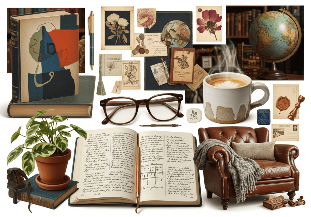
They created a mood board for each. For the “literary sanctuary,” the board looks like this:

And for “curated explorer,” it looks like this:
Step 4: Designing the visual system
Designing the visual system is the phase where the selected creative territory is translated into a structured, repeatable identity system. The goal is not to produce individual designs but to define a set of rules and components that can generate consistent brand expressions across all touchpoints.
This phase typically begins with establishing the core identity components, starting with the logo system, color palette, and typography. These elements form the foundation of the brand and must be tested in multiple contexts to ensure legibility, flexibility, and coherence.
Once the core components are defined, designers develop the supporting systems, including layout rules, visual style, iconography, and motion principles. These elements determine how content is structured, how imagery is selected and treated, and how the brand behaves in digital environments.
Key activities include:
- Systemization: Turning design decisions into formal rules, such as spacing ratios, grid structures, typographic hierarchies, and color usage logic
- Context testing: Applying the system to representative use cases, such as a homepage, social media post, email, product packaging, or printed flyer
- Edge case validation: Ensuring the system still works in less common scenarios, such as small screens, long headlines, or multilingual content
- Accessibility checks: Verifying contrast ratios, font sizes, and layout patterns to ensure usability for diverse users
This system-based approach ensures that branding design remains consistent, scalable, and maintainable as the brand grows and new channels are added.
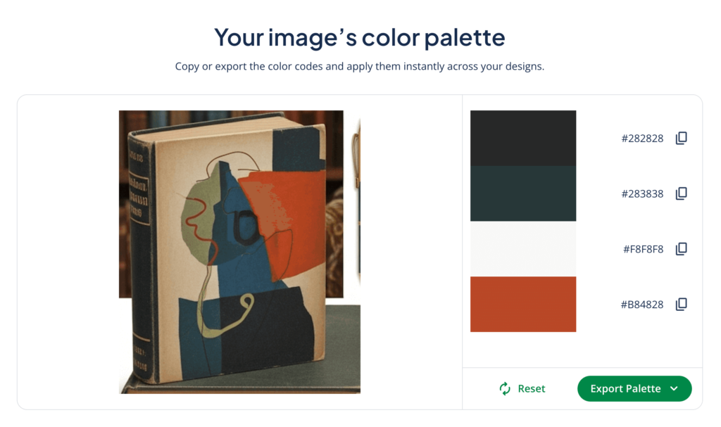
The tool suggests a black, a cool white, a dark blue-green, and a warm brick red. The design team likes this as a start but decides to experiment with a color wheel to check if they want subtle variations of these hues.
Step 5: Brand guideline documentation
Documenting brand guidelines is the process of translating the visual system into a clear, usable reference document that helps anyone—from a product manager to a marketing intern—apply the brand consistently. Without guidelines, even strong branding design can deteriorate through misinterpretation, shortcuts, and ad hoc decisions.
Effective guidelines balance visual examples with decision-making logic. A complete set of brand guidelines typically includes:
- Brand foundations: Brand purpose, positioning, values, tone of voice, and key messaging principles. This provides strategic context so design decisions remain aligned with business goals
- Logo usage rules: Clear instructions on logo variations, minimum sizes, spacing, acceptable backgrounds, and prohibited uses
- Typography system: Font families, hierarchy, line spacing, alignment rules, and fallback options for different platforms
- Color system: Primary and secondary palettes, usage logic, contrast ratios, and accessibility standards
- Layout and grid system: Margins, spacing units, composition principles, and responsive behavior
- Imagery and illustration style: Guidelines for photography subjects, framing, lighting, color treatment, and illustration tone
- Interface and motion principles: Interface components, animations, transitions, and interaction patterns (for brands with digital presence)
Well-designed guidelines focus on clarity and usability, not just aesthetics. They are structured as a working manual rather than a marketing brochure, with practical examples and rationale behind key rules.
Purpose
The typography system is designed to support Northbound Books’ identity as a calm, literary, and approachable space. All written communication should prioritize readability, clarity, and a consistent editorial tone.
Typefaces
1. Primary typeface: Merriweather (serif).
- Used for: Headlines, long-form text, editorial content, book descriptions
- Rationale: This typeface reflects the brand’s literary positioning and should be used whenever the goal is to encourage reading or convey thoughtful content.
2. Secondary typeface: Inter (sans-serif)
- Used for: Navigation menus, labels and signage, interface elements, buttons and forms
- Rationale: This typeface is optimized for clarity and fast recognition in functional contexts.
Typographic hierarchy
H1: Primary headline
- Used for: Events and promotions, campaign titles, featured content
- Usage notes: Should be used sparingly and never more than once per page or layout. Signals the most important content and anchors the reader’s attention.
H2: Section heading
- Used for: Page sections, content groupings, shelf category titles
- Usage notes: Organizes content into subsections, making it easier to scan and navigate. Can be repeated multiple times per layout but should remain subordinate to H1.
Body text: Editorial content
- Used for: Book descriptions, staff recommendations, blog and newsletter content
- Usage notes: Should maintain a minimum line height of 1.5 for readability. Paragraphs should be short (2–4 lines) to facilitate scanning, and formatting should remain consistent (avoid unnecessary caps, italics, or color changes).
Additional usage rules
- Do not use additional typefaces without approval
- Do not mix serif and sans-serif within the same text block.
- Do not use all caps for headlines or body text.
- Ensure sufficient contrast between text and background for accessibility.
Rationale
The combination of a humanist serif and a neutral sans-serif ensures that Northbound Books maintains a consistent reading experience across posters, website pages, newsletters, shelf signage, and digital interfaces while balancing atmosphere with usability.
Make sure your brand guidelines don’t have spelling or grammar errors, which could lead to misunderstandings. Review guidelines carefully before publishing, and use QuillBot’s Grammar Checker to quickly spot and fix mistakes.
Step 6: Implementation and review
Implementation is the phase where your branding design system is deployed across real-world touchpoints. This is also where the system is tested and refined based on practical constraints.
When implementing branding design, it usually involves rolling it out across:
- Website and digital products
- Physical assets (e.g., product packaging, signage, printed materials)
- Social media templates
- Marketing and advertising materials
- Sales pitches and customer support materials
- Internal documents and presentations
- Other web presences (e.g., partner websites, review sites)
Your primary goal should be consistency under real conditions, not theoretical perfection. Implementation often reveals gaps in the design system, such as missing layout rules, insufficient color flexibility, or typography that performs poorly at certain sizes.
Good implementation also includes team onboarding (so internal teams know how to apply the branding design properly) and quality control (so misalignment is identified and corrected as early as possible).
Branding design is not a one-off project. Brands evolve over time due to new products, markets, technologies, and audience expectations. This makes periodic review essential.
A structured review process typically involves:
- Auditing brand consistency across channels
- Evaluating performance against business goals
- Identifying friction in usability or production
- Updating guidelines to reflect new needs
Strong brands treat branding design as an ongoing system, not a finished deliverable. Disciplined implementation combined with regular review sees that the brand remains coherent, relevant, and operationally efficient over the long term.
Branding design tips
Effective branding design is not about originality for its own sake; it’s about building a system that is clear, usable, and aligned with your brand’s strategic goals. The following tips will help your branding design perform well in real-world conditions.
- Lead with strategy, not aesthetics. Visual decisions should always be grounded in brand positioning, audience research, and business objectives. Designing without a strategic foundation often leads to visually appealing but incoherent identities.
- Design systems, not individual assets. Focus on defining rules and components rather than individual deliverables. A strong branding system should generate consistent outputs across formats, teams, and platforms without requiring constant redesign.
- Keep it simple. Simple systems are easier to maintain and more resilient over time. Excessive color palettes, decorative typography, or overly rigid layouts reduce flexibility and increase production friction.
- Be adaptable. Successful brands are open to feedback and change, and it’s common to update branding design as a brand grows and evolves. Staying open and adaptable will make sure your brand stays fresh and aligned with your audience.
- Document everything. Unwritten rules are the easiest to break. Clear brand guidelines prevent inconsistency and reduce dependency on individual designers or stakeholders.
Common mistakes in branding design
Many branding design failures aren’t because of poor visual quality. Rather, projects usually fail due to structural and strategic issues. Some common mistakes in branding design are:
- Designing in isolation: When you treat branding design as a purely visual exercise, the result will lack meaning, positioning, and business relevance.
- Overemphasis on the logo: A logo is just one piece of the brand system. Strong branding depends on layout, typography, color logic, and tone and not on the logo alone.
- Inconsistency across channels: Using different styles for your website, social media, email, and print undermines recognition and trust. Inconsistent branding weakens long-term brand equity.
- Overly rigid systems: Branding systems that are too strict fail in real-world scenarios. A usable system must allow flexibility without losing coherence. As an example, a logo needs various colorways so that it can appear across a variety of background colors.
- Ignoring accessibility and usability: Your branding design should look good while still being user-friendly. Low contrast, illegible typography, and complex layouts reduce usability and exclude some users, especially in digital environments.
- Lack of documentation and review: Without clear guidelines and review processes, branding deteriorates over time through impromptu decisions and uncontrolled adaptations.
Frequently asked questions about branding design
- How many fonts should you use in branding?
-
You should use 2–3 fonts in branding design. Limiting font faces helps branding stay consistent and credible.
A good strategy is to choose a primary font (for logos, headlines, and titles), a secondary font (for long-form content and user interfaces), and an optional accent font (to use sparingly for decorative purposes).
If you want to brainstorm font choices for your brand, use QuillBot’s AI Chat to generate ideas.
- How do you use color psychology in branding?
-
To use color psychology in branding design, choose colors that align with the brand’s positioning and audience expectations.
Color psychology in branding affects how brands are perceived by consumers. Using color psychology and color theory, brands communicate emotions, values, and personality through their visual identities.
For example, blue often conveys trust and professionalism, while yellow signals energy and creativity.
QuillBot’s color palette generator and color wheel can help you as you explore how to use color psychology in branding.
Cite this QuillBot article
We encourage the use of reliable sources in all types of writing. You can copy and paste the citation or click the "Cite this article" button to automatically add it to our free Citation Generator.
Santoro, K. (2026, March 08). Branding Design | Principles, Elements & How To. Quillbot. Retrieved March 28, 2026, from https://quillbot.com/blog/branding/branding-design/