Serif vs Sans Serif Fonts | Differences & Examples
One of the most basic typography decisions you’ll have to make is whether to use a serif vs. sans serif font. This decision might seem trivial—serifs are, after all, just the tiniest of lines that cap the ends of letters—but their presence or absence can profoundly impact how your document, logo, or ad is perceived and the message it sends.
Sometimes, visualizing the effect that small choices can have on your design is difficult. Tools like QuillBot’s AI design generator can help you prototype your ideas before implementing them.

Serif vs sans serif font differences
The distinction between serif and sans serif fonts comes down to serifs. These are the small, decorative strokes that cap the ends of letters in fonts like Times New Roman. Serif fonts have them, and sans serif fonts do not. “Sans” is French for “without,” so “sans serif” directly translates to “without serif.”
Serif vs. sans serif fonts

The history of the serif
Serif fonts are old, dating back to ancient Greek and Roman times. One theory about their origin is based on how words were carved into stone: painters first painted the words, then carvers would follow the brushstrokes to etch the letters. These brushstrokes flared at the ends, resulting in serifs.
Sans serif fonts are generally considered a more recent creation, though they are found in some ancient writing, like Norse runes. They were quite controversial when first introduced in the late 1800s (they were even called “grotesque”), but sans serif fonts gradually became accepted as a modern alternative to serif fonts. Sans serif fonts are very common on digital displays, as some screens lack the resolution to render the fine details of serifs.
Which is easier to read?
A key consideration when selecting a font is readability. However, there’s mixed evidence as to whether serif vs. sans serif fonts are easier to read. Some claim that serifs aid in distinguishing letters; others note that they increase visual clutter, especially at small font sizes. Importantly, there are no scientific studies that conclusively demonstrate that either serif or sans serif fonts are best for reading paragraphs of text.
So what should you do? If readability is a key concern for you (which it should be, if you’re trying to create accessible content!), choosing a serif versus sans serif font isn’t going to be your most important decision. Instead, focus on the size, spacing, and contrast of your text; the right balance of these elements will have the biggest impact.
When to use serif vs sans serif fonts
If choosing a serif or sans serif font isn’t going to make or break the readability of your text, does it even matter which one you pick? Of course!
Serif and sans serif fonts each convey a distinct message and tone. Serif fonts are rooted in antiquity, so they convey a sense of authority and tradition. Sans serif fonts, on the other hand, feel lighter and more modern. Your choice of one or the other will send an implicit message about how you want your content to be perceived.
Here are just a few examples of use cases where serif or sans serif fonts might be a better choice:
- The logo for a new tech startup: A sans serif font is the obvious choice here to convey a sense of innovation and minimalism.
- A pamphlet for a high-end law firm: Here, a serif font will help convey that the firm is established and trustworthy.
- The cover of a design magazine: Sans serif fonts were “avant garde” when they came out, so they would be a strong option. However, a serif font might make sense for a more luxurious, timeless style.
Examples
There are scores of examples of serif and sans serif fonts. Below are a few for you to try in your next project.
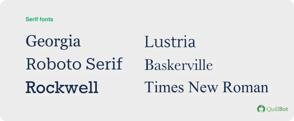
Serif font examples
These timeless typefaces are great examples of serif fonts.
Serif fonts
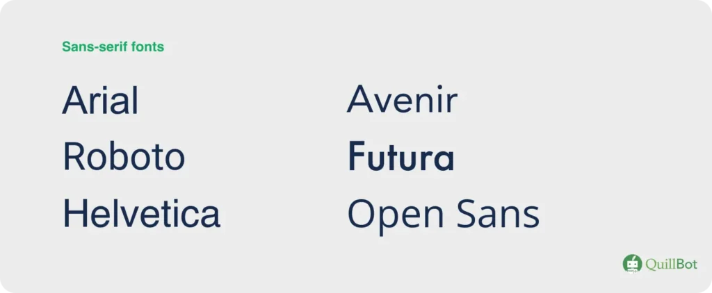
Sans serif font examples
For a more modern feel, try these sans serif fonts.
Sans serif fonts
Frequently asked questions about serif vs sans serif fonts
- What are sans-serif vs serif fonts?
-
The distinction between serif vs. sans-serif fonts is a core principle of typography.
Serif fonts have small decorative strokes that cap each letter, called serifs. A common serif font is Times New Roman.
Sans-serif fonts (from the French “sans,” meaning “without) do not have serifs. A common sans serif font is Arial.
Serif fonts convey tradition and authority, whereas sans-serif fonts have a more modern feel.
- What is a serif font?
-
A serif font is a typeface that has small decorative lines (called “feet”) at the end of each stroke in a letter. The most common serif font is Times New Roman.
Serif fonts are common in print media (e.g., books and magazines), where they’re more reader-friendly. For example, lowercase letter A is much more distinct from lowercase letter O in a serif font.
When you’re working on creative projects and want to experiment with lettering, QuillBot’s free AI image generator can show you how letters of the alphabet look in serif or sans serif fonts.
- What is a sans-serif font?
-
A sans serif font is a typeface that does not have serifs (decorative lines called “feet” at the end of each letter’s strokes). “Sans” means “without.”
Sans-serif fonts are common in reading materials for early learners, web-based reading materials, and signage. Arial and Verdana are two common sans-serif fonts.
When you’re designing something with letters and want to experiment with different typefaces, try QuillBot’s free AI image generator. For example, you can prompt it to make an image of a letter A without serifs and with any type of background.
- Should I use serif or sans-serif fonts in a presentation?
-
Both can work, but sans-serif fonts are usually the safer choice for presentations. Their clean, simple shapes stay crisp on screens and projectors, making them easier to read from a distance. Serif fonts can still be effective for titles or more formal topics, but thin serifs may disappear on low-resolution displays.
If you’re not sure which option suits your deck, QuillBot’s free AI presentation maker provides templates with pre-paired, presentation-safe fonts so you can experiment and see what works best for your topic.
Cite this QuillBot article
We encourage the use of reliable sources in all types of writing. You can copy and paste the citation or click the "Cite this article" button to automatically add it to our free Citation Generator.
Heffernan, E. (2026, February 11). Serif vs Sans Serif Fonts | Differences & Examples. Quillbot. Retrieved April 6, 2026, from https://quillbot.com/blog/typography-and-fonts/serif-vs-sans-serif-fonts/