Brand Kit | Definition, Components & How to Create
A brand kit is a collection of visual assets that serves as a go-to resource for creating on-brand marketing content. Brand kits usually include logos, typography, color palettes, imagery guidelines, and tone of voice guidelines.
A brand kit is essential for a consistent brand identity across all channels, and it makes it easier for teams to create on-brand, recognizable content that looks and feels professional.
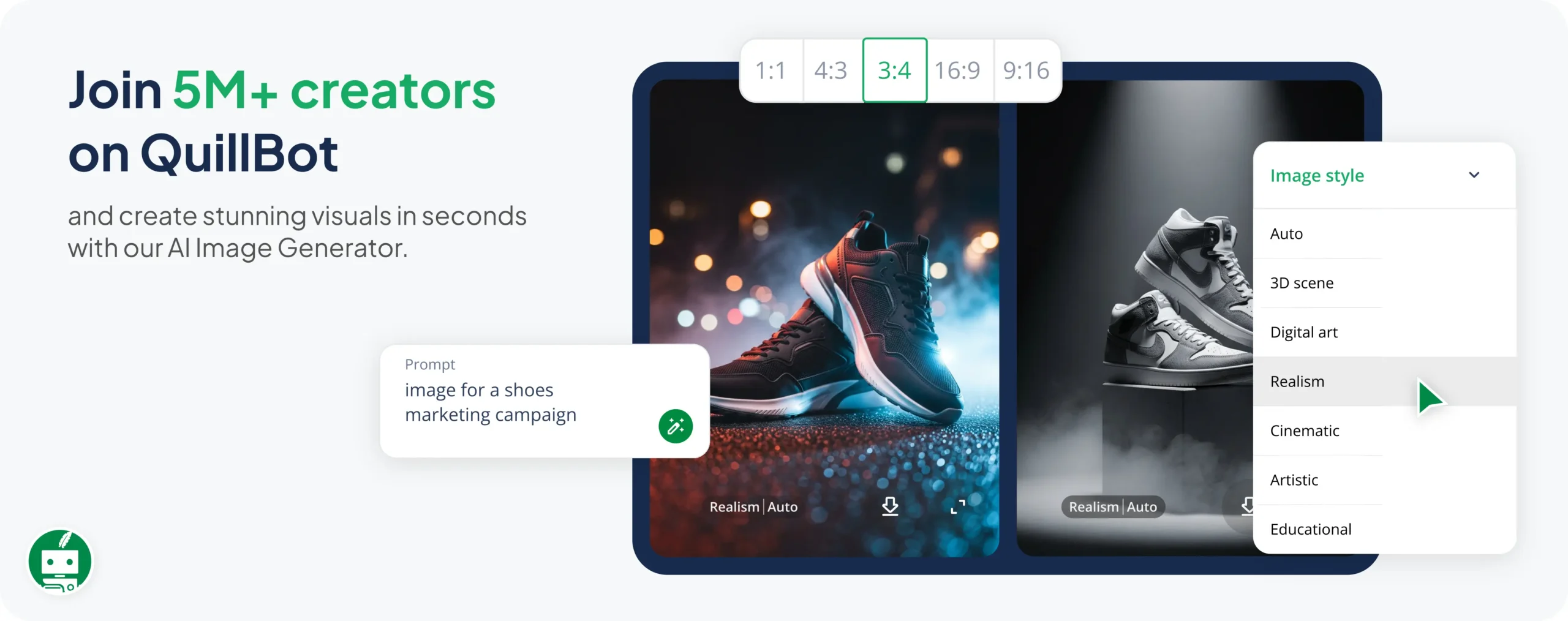
You can create your own brand kit as a presentation using QuillBot. Write a contextual prompt, and QuillBot will generate a customized, editable slide deck for you in moments.

What is a brand kit?
A brand kit is a curated collection of design elements that define a company’s or organization’s brand identity. A brand kit ensures that a brand is visually and tonally consistent across all channels and touchpoints, which improves recognition and builds trust with the target audience.
A brand kit is usually created as the result of the branding design process. Like all aspects of branding, brand kits must be tied to a clear brand purpose and to the target audience in order to make an impact.
What does a brand kit include?
Brand kits include all the components related to the “look and feel” of your brand. The key components of a brand kit are listed in the table below.
| Component | What it includes | Example |
|---|---|---|
| Logo pack | Primary logo, secondary logo, icon/favicon, and variations (e.g., horizontal, stacked, monochrome) | A full-color logo for websites, a white version for dark backgrounds, and a simplified icon for social media profiles |
| Color palette | Primary and secondary brand colors with HEX, RGB, and CMYK codes | Primary: #ADD8E6 (light blue)
Secondary: #34A853 (green) Neutral: #F1F3F4 (light gray) |
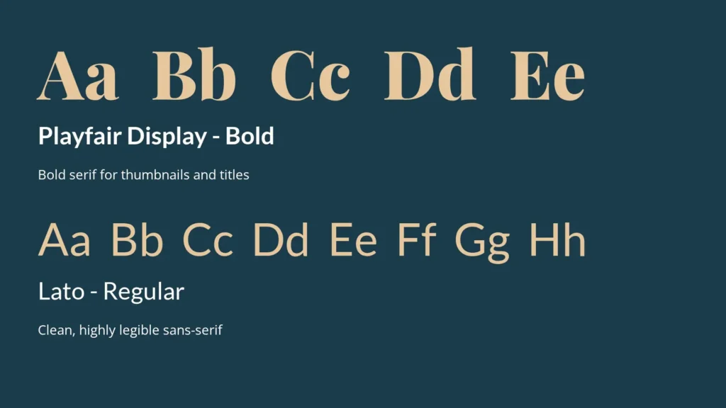
| Typography | Font families, sizes, weights, and usage rules | Headings: Montserrat Bold Body text: Open Sans Regular Defined line spacing and hierarchy |
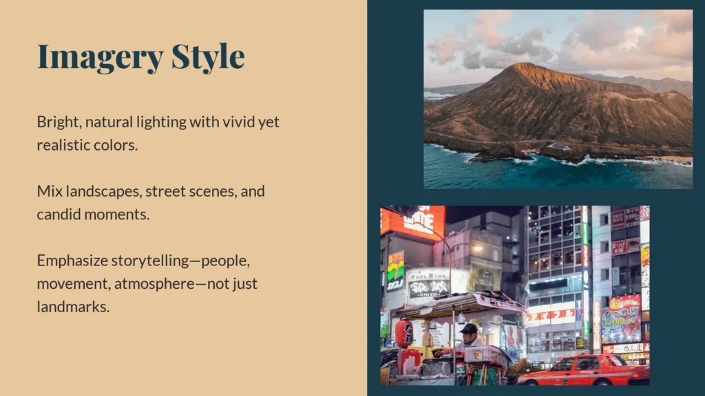
| Imagery style | Guidelines for photos, illustrations, icons, and graphics | Bright, natural lighting photography with diverse subjects; flat-style illustrations with soft gradients |
| Iconography | Style and usage of icons across platforms | Minimal, line-based icons with rounded edges used consistently in apps and presentations |
| Brand voice | Tone, personality, and communication style | Friendly, clear, and professional tone with simple, jargon-free language |
| Messaging guidelines | Taglines, value propositions, and key phrases | Tagline: “Spark your curiosity”; consistent use of action-oriented language |
| Layout and spacing | Grid systems, margins, and alignment rules | 8px spacing system with consistent padding and alignment across designs |
| Templates | Ready-to-use files for documents and content | Branded email signature, presentation deck, and blog post template |
Brand kit vs brand guidelines vs style guide
These terms are often used interchangeably, but they’re not the same thing. Each serves a different purpose, and understanding the distinction helps you build a more complete and usable brand system:
- A brand kit is a collection of visual and verbal assets that serves as a quick reference during content creation.
- Brand guidelines are more comprehensive and strategic. They explain how and why a brand looks and sounds the way it does. Think of them as a “brand bible,” as they outline the whole picture—brand mission, story, vision, values, target audience, etc.
- A style guide is narrower and usually focused on written content. It defines grammar preferences, tone of voice, formatting rules, vocabulary choices, use of emojis, and more. Some style guides may also include visual style rules.
| Type | Focus | Includes | Primary use |
|---|---|---|---|
| Brand kit | Visual assets and quick-use resources | Logos, colors, fonts, core messages, templates | Creating content quickly and consistently |
| Brand guidelines | Full brand system and rules | Brand story, visual rules, voice, usage examples | Maintaining long-term brand consistency |
| Style guide | Writing and communication standards | Tone, grammar rules, capitalization, vocabulary, emoji use | Ensuring consistent written content |
In practice, these three elements often overlap. A brand kit may be part of your brand guidelines, and a style guide may be included within both. Together, they form a complete framework for how your brand looks, sounds, and communicates.
Why is a brand kit important?
Brand kits are important because they make it easier for teams to create effective, consistent content efficiently. More specifically, some of the core benefits of brand kits are:
- Brand recognition: A consistent set of visual and messaging elements helps your audience immediately identify your brand across platforms, increasing recall and visibility.
- Brand trust: Consistency signals professionalism and reliability, helping to build credibility among customers and partners over time. When people get what they expect time and time again, that fulfillment of expectations fosters trust.
- Faster content creation: For marketing, content, and design teams, content creation is much speedier when they don’t have to second-guess their decisions.
- Stronger collaboration: Designers, writers, and marketers all work from the same set of assets and rules, reducing errors and miscommunication.
- Easier onboarding: New team members or external collaborators can get up to speed faster when all brand elements are organized and accessible in one place.
Who needs a brand kit?
Brand kits aren’t only for big brands or companies. Everyone—right down to a solo freelancer—can benefit from having a brand kit. Here’s how different people can use them:
- Marketing teams: Marketing teams rely on brand kits to produce campaigns efficiently and maintain brand consistency across channels, even when multiple team members are involved.
- Content creators: YouTubers, bloggers, and social media influencers can use a brand kit to create visually recognizable content that strengthens audience loyalty.
- Freelancers: Freelancers can present a cohesive personal brand to clients, making proposals, portfolios, and marketing materials look polished and unified.
- Small businesses: A brand kit leads to consistent identity across all touchpoints, from social media to packaging, helping small businesses appear professional and memorable.
- Distributed teams: Teams spread across locations benefit from a centralized brand kit that ensures everyone uses the same assets, fonts, colors, and templates, reducing miscommunication and errors.
Essentially, a brand kit can help anyone create a consistent brand presence that supports recognition and credibility.
How to create a brand kit
These five steps explain how to create a brand kit so you can organize the strategic and visual elements of your brand into a usable system.
Without this foundation, your brand kit will lack direction. So if you don’t have your branding fundamentals sorted already, go do that and come back to this guide when you’re ready.
1. Choose where you’ll create your brand kit
Decide on the tool or platform you’ll use to build and store your brand kit. This could be a design platform, a shared document or presentation, or a team workspace or folder. The key is accessibility; your brand kit should be easy for collaborators to find, use, and update.
For example:
- If you’re storing everything in a folder, decide how you’ll name files.
- If you’re creating a shared presentation, think about how to name slides.
If you’re not sure about the best way to name your files or assets, brainstorm naming ideas with QuillBot’s AI Chat.
2. Upload design assets and explain visual rules
A consistent visual identity depends on a clear, detail-oriented explanation of the visual assets a brand can (or can’t) use as well as guidelines and constraints about how to use those assets.
In your brand kit, define:
- Logo usage: Which colors can your logo be rendered in? Can it be used over images, or only solid colors? What positioning and spacing rules must be followed when using the logo? Include a primary logo (like the one on your website), a secondary logo (for when the primary logo doesn’t fit), a brandmark (a standalone symbol or icon), and a favicon (a tiny pixel logo used for brand recognition in browser tabs).
- Color palette: Detail your primary, secondary, accent, and neutral colors, with swatches and exact HEX codes. If your team needs other information to be able to use these colors—like RGB values or color names—include those too.
- Typography: Outline the fonts used for your brand. It’s best to stick to two: one for headings and one for body text. Include font weights, line heights, kerning, etc. if relevant.
- Imagery style: Explain what types of visuals represent your brand. Should images feel polished or candid? Minimal or detailed? Define guidelines for photography, illustrations, and graphics so all visuals align with your brand’s tone and aesthetic.
- Iconography and graphics: If your brand uses icons, patterns, or other graphic elements, define their style (e.g., line vs. filled, rounded vs. sharp) and how they should be used across different materials.
3. Outline voice and tone
Next, outline the verbal aspects of your brand. This part doesn’t need to be too in-depth; save that for your brand guidelines. Your brand kit is supposed to offer quick, actionable tips that your team can use as they create content.
So, include:
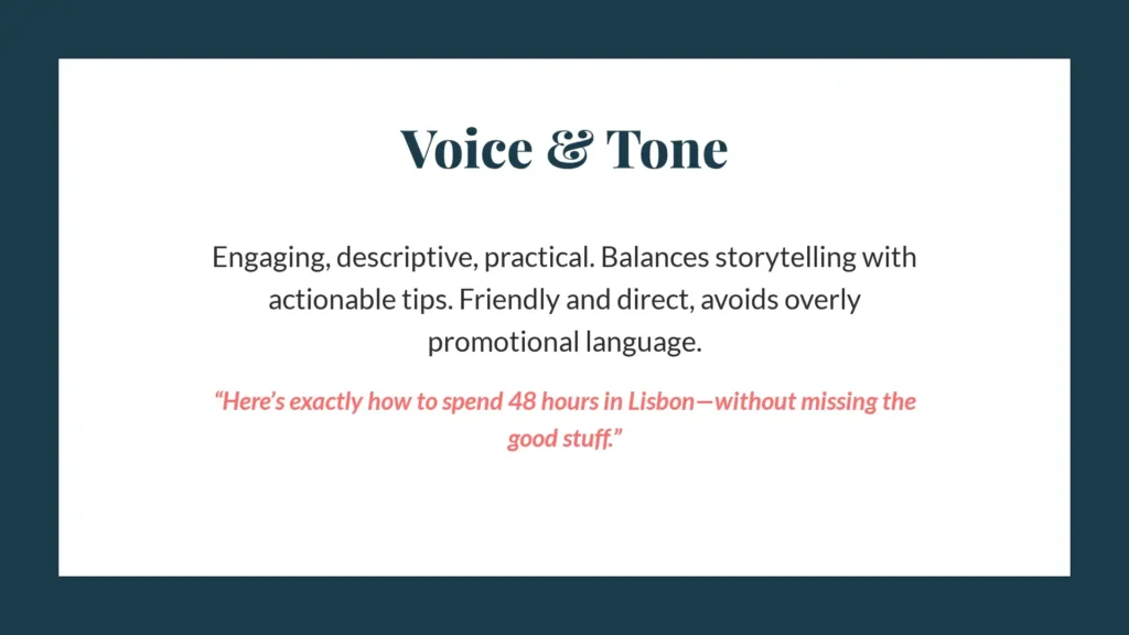
- Brand voice: Is your brand voice formal or conversational? Technical or accessible? Confident or friendly? Describe your voice using a few clear traits that express your brand’s personality.
- Tone: Explain how the tone of your language should shift depending on the situation. For example, marketing content may be more persuasive and energetic, while customer support communication should be calm and solution-oriented.
- Sample messaging: Include short examples of on-brand copy, such as headlines, social media captions, or email snippets. These practical references help orient your team when they’re writing new content.
- Dos and don’ts: Provide concrete examples of what your brand should and shouldn’t sound like. This helps eliminate ambiguity and gives writers a clear reference point.
4. Document formatting guidelines and include some templates
Clear formatting rules make your content easier to produce and guarantee consistency across different formats and channels. Templates take this a step further by giving your team ready-to-use starting points.
In your brand kit, include:
- Formatting standards: Set rules for headings, subheadings, paragraph length, bullet points, alignment, and spacing. This ensures all documents follow a consistent structure and are easy to read.
- Text conventions: Specify capitalization rules (e.g., title case vs. sentence case), punctuation preferences, and styling choices like bolding or italics.
- Templates: Provide some pre-designed assets such as presentation decks, social media posts, email formats, email signatures, or blog outlines. These help users apply your brand quickly without building from scratch and serve as examples if they need to create something new.
5. Centralize and maintain the kit
Your brand kit is only useful if your team can find it, use it, and trust that it’s up to date. Without a clear system for access and maintenance, even the best-defined brand kit tends to be ignored or misapplied.
Decide on:
- Storage location: Choose a single “source of truth” where all assets and guidelines can be found. This might be a shared drive or file, a design platform, or an internal workspace.
- Access and permissions: Decide who can view, edit, and update the brand kit. Make sure that employees, freelancers, and collaborators have the appropriate level of access.
- Preferred file formats: Consider any preferred file formats, too. For example, it’s generally better to save images as PNGs instead of JPGs to maintain quality, and logos are best maintained as vector formats—like SVGs—that are infinitely scalable.
- Version control: Establish a system for tracking updates so users know they’re working with the latest assets and rules. You may want to include version naming, timestamps, or changelogs. If you have a simple brand kit hosted in a shared document, consider adding a “Last Updated” field.
- Usage guidance: Make it clear how the brand kit should be used in day-to-day work, and encourage teams to refer to it regularly when creating content. When you roll out your brand kit, set up a training so your team has the chance to review and ask questions.
Brand kit examples
Below are three fictional examples of different brands and sample parts of their brand kits. Each of these brand kits was created using QuillBot.
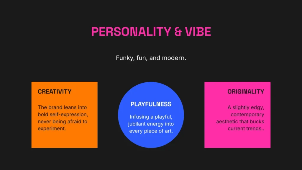
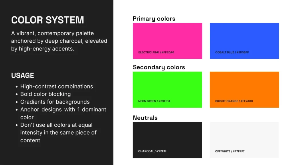
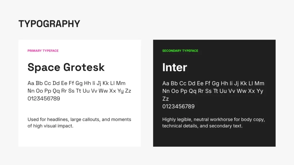
Brand kit for an online art shop
Sophia, a ceramicist and illustrator, runs an online shop selling prints, paintings, and handmade ceramics through her website and social media. She also sells her artwork at local markets or design fairs.
As a solopreneur, she needs a brand kit to keep her visuals and messaging consistent across product listings, packaging, and Instagram. Sophia defines her style as “modern, funky, and fun,” and she leans into this when creating her brand kit. See example pages from her brand kit below.
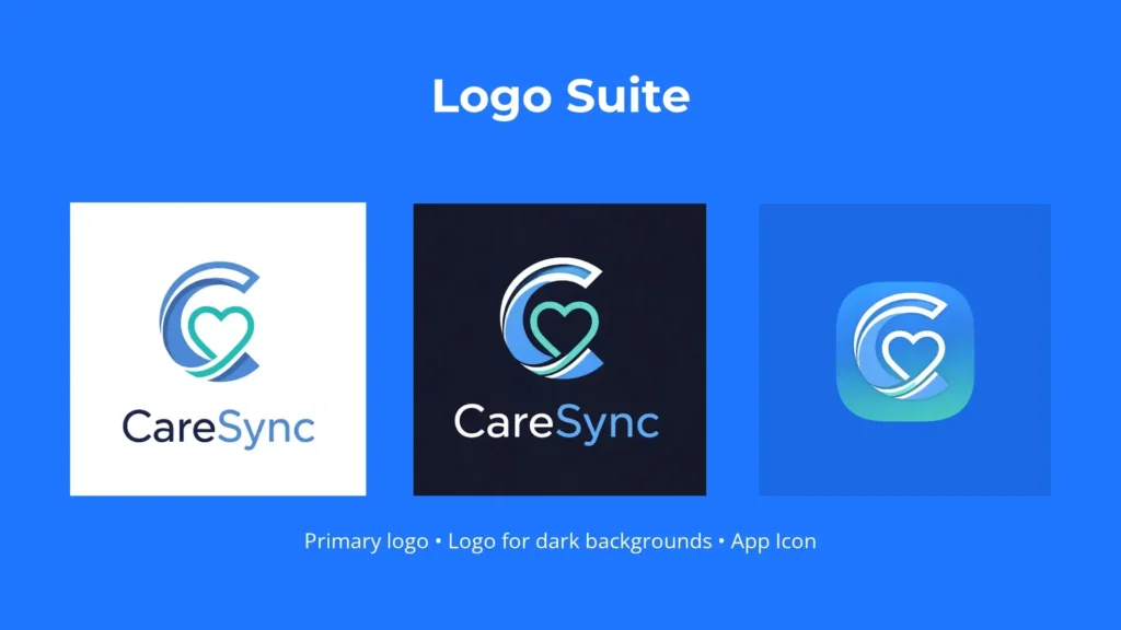
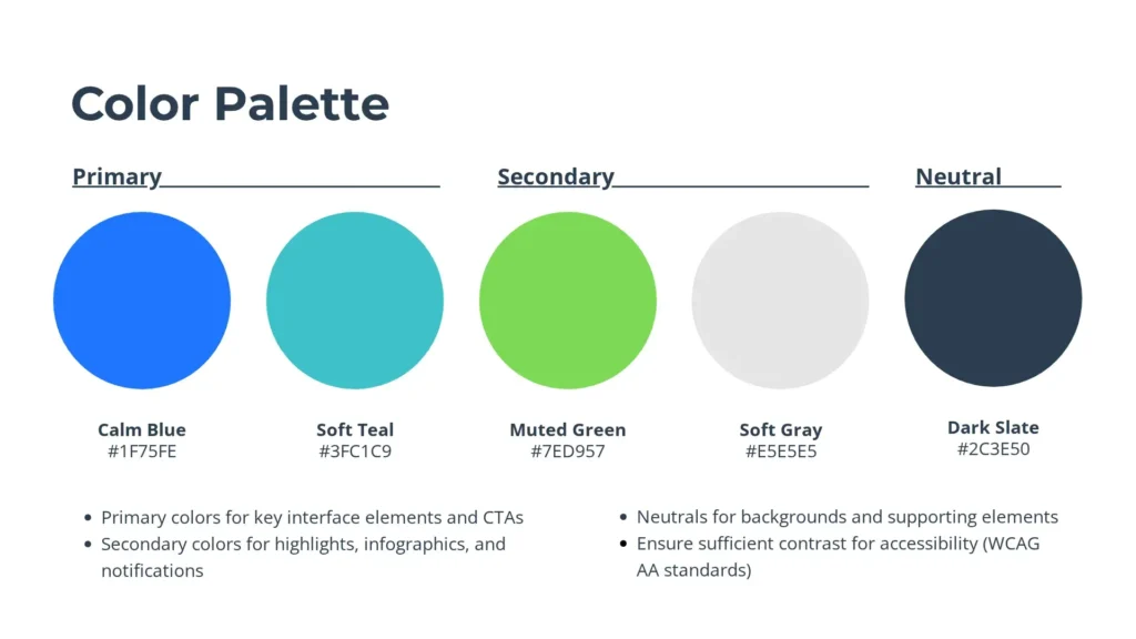
Brand kit for a SaaS startup
CareSync is a healthtech startup that provides a patient scheduling and telemedicine platform for small clinics. The brand’s mission is to be a reassuring solution for both its clients and their users, so its branding designers choose calm color tones, easily legible fonts, and symbols that promote trust and care.
As the company grows, it needs a brand kit to ensure consistency across its app interface, website, onboarding materials, and investor presentations. CareSync creates its brand kit as a shared presentation so anyone from their team can access it; find a few of its slides below.

Brand kit for a social media content creator
Kai, a travel content creator, shares destination guides, itineraries, and cultural insights across YouTube, Instagram, and TikTok. Kai also works freelance as a type of travel agent, planning carefully customized itineraries for their clients.
As their content expands, Kai needs a brand kit to maintain a cohesive identity across platforms and formats. They create a simple brand kit—simple enough to work for a solo creator, but robust enough to represent their identity. Below are a few pages from Kai’s brand kit.
Brand kit mistakes to avoid
These are some common brand kit mistakes to avoid, most of which deal with including too much or not including enough information.
Overfocusing on visuals
A brand kit isn’t just about design. Ignoring voice, tone, and messaging leads to inconsistent communication, even if visuals are cohesive.
How to avoid it: Make sure to include communication guidelines, too.
Creating but not maintaining the kit
An outdated brand kit is counterproductive. Teams may use old assets or start to ignore the kit entirely if it’s not maintained and updated.
How to avoid it: Set up a maintenance system to regularly check in, and work your brand kit into branding workflows so it isn’t forgotten as you make changes.
Missing logo variations
Without multiple logo formats (e.g., light and dark, horizontal and stacked), teams may misuse the logo or create inconsistent alternatives. No one logo format looks good everywhere, so your team needs options.
How to avoid it: Include variations of your logo for different contexts, including different sizes and colors.
Complexity overload
Overly complicated guidelines make the kit difficult to use, leading teams to ignore it or apply it incorrectly.
How to avoid it: Keep your brand kit as simple as possible; avoid jargon, verbosity, and overly casual language.
Lack of usage guidelines
Providing assets without clear instructions results in inconsistent application, such as incorrect logo placement or color misuse.
How to avoid it: For every asset, include usage guidelines. Update these guidelines to integrate the answers to questions that team members bring up (e.g., “Can we use our accent color as the background of a paid ad?”).
Failure to test visuals
Visual elements that look good in one format may not work across devices or platforms, leading to usability and readability issues.
How to avoid it: Test visuals in different contexts before documenting them in your brand kit. Test webpages in both desktop and mobile views.
Frequently asked questions about brand kit
- How do you update a brand kit as a company evolves?
-
You should update a brand kit as a company evolves and changes aspects of its branding. This could include a full rebranding or changes to certain elements, like an updated logo, a new tone of voice, or changes to colors or typography.
Create your brand kit as a presentation in QuillBot, and you’ll be able to update it as your brand evolves.
Cite this QuillBot article
We encourage the use of reliable sources in all types of writing. You can copy and paste the citation or click the "Cite this article" button to automatically add it to our free Citation Generator.
Santoro, K. (2026, March 24). Brand Kit | Definition, Components & How to Create. Quillbot. Retrieved March 27, 2026, from https://quillbot.com/blog/branding/brand-kit/