What Is a Logo | Definition & How to Create
Understanding what a logo is and how it functions is one of the first steps in building a strong brand identity. A logo is one of the most fundamental assets in any brand identity system, serving as the primary visual marker through which a brand is recognized, remembered, and differentiated.
This guide walks through what a logo is, why it’s so important, and the different types of logos. You’ll also learn about the parts of a logo and how QuillBot’s AI logo generator can help you brainstorm ideas for creating your own logo.
What is a logo?
A logo is a graphic symbol that identifies and represents a brand or organization. Logos can be composed of symbols, text, images, or a combination of these elements. Logos can be figurative or abstract and sometimes include the name of the organization they represent.
Traditionally, logos were created via manual processes like drawing, hand lettering or transfer lettering, and physical cut-and-paste. Nowadays, nearly all logos are created digitally in vector format to allow for infinite scalability.
Why are logos important?
Logos are important for establishing brand identity and creating lasting connections with your audience. A logo serves as the primary visual identifier for your brand, and along with the brand’s name, it is what people most easily remember.
That said, logos do more than just identify a brand. A good logo also:
- Makes a strong first impression: A logo is often the first element to be noticed by your audience. A well-designed one makes a memorable impression that grabs the audience’s attention, sparks their interest, and acts as shorthand for what the brand is all about.
- Sets the brand apart from competitors: In crowded markets and endless streams of advertising, a unique logo differentiates your brand. A logo should express what makes a brand different in its market. Is your brand affordable, luxurious, sustainable, classic, playful, or rebellious? Whatever the vibe, your logo should communicate that subtext.
- Shapes brand identity: Think of a logo as the visual cornerstone of a brand. To that end, a logo should establish your brand identity, giving the audience a first taste of the look and feel of your brand. Logos must therefore be cohesive with the rest of your branding to make sure your identity is clear across all visual cues.
- Communicates brand purpose and values: If a logo is a visual cornerstone, then it should also convey a brand’s purpose and values. This may be done implicitly through different design elements. For example, a sustainable brand may choose green or earthy colors for its logo, while a luxury brand may select serif fonts that speak to tradition and timelessness.
- Builds brand trust: The consistent use of a logo across brand touchpoints (e.g., website, emails, and product packaging) fosters awareness and trust. It is a professional and memorable visual anchor that validates your brand’s legitimacy and creates familiarity among your audience, leading to long-term loyalty.
History of logos
In ancient and medieval times, certain inventions and techniques laid the way for modern-day logos. Egyptians used hieroglyphics to mark ownership of objects and livestock. Cylinder and stamp seals served as administrative tools and used unique combinations of figures and characters to show the origin of documents, commodities, and more. Ancient coins often featured monograms or symbols to show where they originated from, and coats of arms denoted noble families through imagery.
Logos as understood today developed during the Industrial Revolution in the 18th and 19th centuries. As mass production spread, and as the middle class—and their purchasing power—grew, manufacturers began to mark their products with memorable symbols or lettering. The first modern logo is widely considered to be Bass Brewery’s red triangle, trademarked in 1876.
Types of logos
There are different types of logos, each with its own applications. Logos are typically classified into seven main types, as outlined in the table below.
| Type | What it looks like | Branding notes | Brand examples |
| Wordmark (logotype) | The brand name as the entire logo, relying on typography and spacing to create identity | Great for brand recognition and SEO-friendly branding | Coca-Cola, Visa, Canon, FedEx |
| Lettermark (monogram) | Initials or abbreviations instead of the full name | Ideal for long or complex brand names | IBM, HBO, CNN, NASA, HP |
| Pictorial (symbol) | A literal, recognizable icon to represent the brand (e.g., an animal or object) | Works best once brand awareness is established | Apple, Target, Shell, Instagram, |
| Emblem | Text enclosed inside a symbol or badge | Feels traditional and authoritative; harder to scale digitally | Starbucks, Harley-Davidson, NFL, BMW, Harvard University |
| Abstract | A non-literal shape or form to convey brand values (e.g., overlaid triangles) | Requires strong marketing to build meaning; is adaptable over time | Nike, Pepsi, Adidas, Airbnb, Mastercard |
| Mascot | An illustrated character | Can humanize the brand and build connection; strong for family and consumer brands but not ideal for all industries | KFC, Planters, Michelin, Duolingo |
| Combination mark | Text combined with a symbol or mascot | Most flexible and common modern format | Lacoste, Doritos, Pringles, Burger King, Amazon |
For example, Duolingo uses a wordmark (“Duolingo” in green, white, or gray), a mascot (Duo the owl), and a combination mark (Duo the mascot and the brand name).
Beyond the seven “core” logo types, there are several advanced logo types used in modern branding. These aren’t always taught in basic design courses, but they’re quite relevant for digital-first and scalable brands:
- Dynamic logos are logos that change form, color, or content while keeping a consistent underlying structure. Examples include Google, whose Doodles appear to honor special days, or MTV, whose logo has been colored (and patterned) in many ways over the years. Dynamic logos express flexibility, creativity, or personalization.
- Animated logos are designed primarily for animation and motion, not static print. They build recognition through movement, timing, and transitions. Some examples are the Netflix and Disney intros, the Pixar lamp, and YouTube. In 2026, motion-first branding is often more important than static logos for digital products.
- Sound logos, or “sonic branding,” build brand recognition without visuals. They’re now considered a formal part of brand identity systems, not marketing fluff. Think of the Intel chime, Netflix’s “ta-dum,” or “I’m lovin’ it” from McDonald’s.
- Generative logos turn logos into living systems instead of fixed assets. These are logos created by an algorithm or rule system that produces countless variations. An example is the MIT Media Lab; its logo uses a square grid that consists of segments of lines that change to form different geometric forms.
Parts of a logo
There are four core parts of a logo. Some effective logos include all of these parts, while others only use certain elements.
Color
Color is one of the most powerful and immediate parts of a logo. It affects how a brand is perceived emotionally and cognitively before any text is read. Different colors trigger different associations. Are you traditional or contemporary? Wholesome or rebellious? Serious or playful?
Understanding color psychology and color theory helps you communicate your brand purpose, values, and personality right through your logo. For example, blue often represents calmness and reliability, and for extra tranquility, you could use a color wheel to find analogous hues like purple or indigo.
Be mindful of limiting the colors you use in your logo to two or three; any more and you risk confusing and overwhelming your audience. These same colors should repeat in the rest of your branding design. This way, color improves recognition, creates visual hierarchy, and ensures consistency across brand touchpoints.
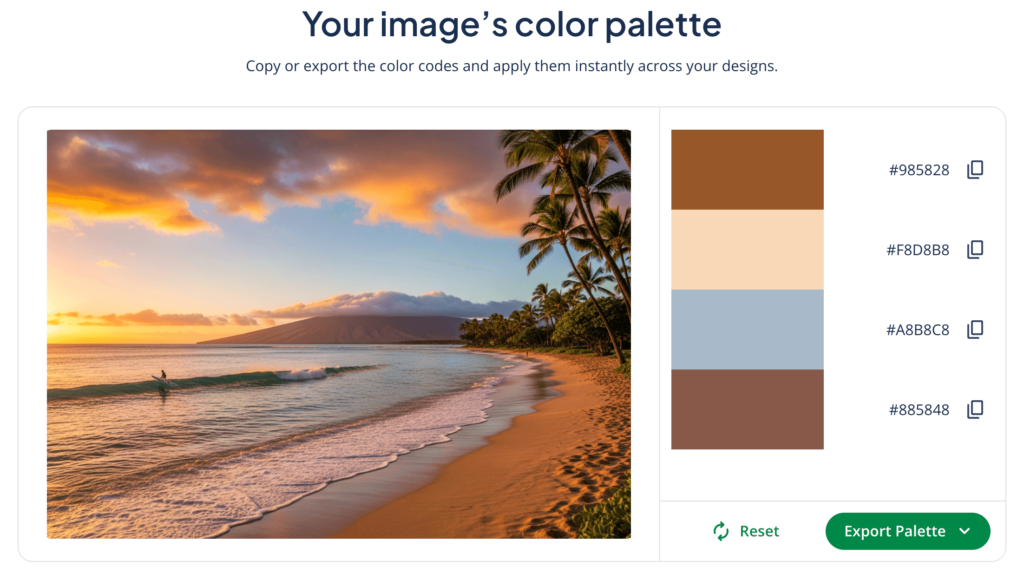
As part of the design process, Louise puts an image of a sunset through QuillBot’s color palette generator, which produces this four-color palette:
From here, Louise prepares mockups of logos in different colorways—never using more than two colors—for the brand to review.
Typography
Typography refers to the style and arrangement of text, including the typeface, letter spacing, and overall composition. Typography plays a central role in conveying a brand’s personality and is therefore a key aspect of designing logos featuring words or letters.
Serif typefaces (which have “serifs,” or small hooks on the end of letters) suggest tradition or authority, while sans-serif typefaces (without serifs) feel modern and minimal. Custom or modified typefaces are frequently used to create distinctive wordmarks or lettermarks.
From a technical standpoint, typography must also be legible at different sizes and adaptable across platforms, as readability and scalability are as important as aesthetic style.
- Serif logos: Vogue, Time, The New York Times, Tiffany & Co., Volvo, L.L. Bean
- Sans-serif logos: Google, Spotify, Microsoft, Airbnb, LinkedIn, eBay, Dropbox
Image
The image component of a logo is the visual symbol that represents the brand, whether it is literal (e.g., an apple or a target) or abstract (e.g., a geometric shape). Images help create quick visual recognition and allow brands to communicate without relying on text, which is especially useful in global or multilingual contexts.
Logo images should ideally be representative of a product, a feeling, or a core value of the brand. Practically speaking, a well-designed logo image is simple, scalable, and versatile enough to work in monochrome, small sizes, and different layouts without losing its identity.
Tagline
A tagline is a short phrase that accompanies a logo to clarify the brand’s positioning, purpose, or value proposition. While not mandatory, taglines are useful for newer brands or those operating in competitive markets where additional context helps clarify differentiation.
From a design perspective, taglines must be secondary to the main logo and remain legible without overwhelming the primary mark. In many professional brand systems, the logo is designed to function both with and without the tagline to maintain flexibility across contexts.
Logos vs branding
A logo is one visual component that represents a brand. Branding is the process of creating a unique identity for a company or organization. Branding involves much more than designing a logo; it affects how people recognize, connect with, and experience a brand.
Key aspects of branding include:
- Brand purpose statement: How the brand explains to the world why it exists
- Brand mission and values: The brand’s goals and what it stands for
- Brand positioning: How the brand differentiates itself in its market
- Brand personality and voice: The tone and style of communication
- Visual identity: The logo, color palette, typography, and other design elements
- Brand reputation: The perception or “gut feeling” people have about the brand
In summary, a logo is one part of branding, albeit an important one. Think of branding as a puzzle you put together and a logo as one key piece.
What makes a good logo?
A good logo is simple, memorable, distinct, relevant, appropriate, versatile, and timeless.
- Simplicity: Simple logos are more easily recognized, remembered, and reproduced. Overly complex designs can be confusing and lose impact at small sizes. Simplicity ensures clarity across all applications.
- Memorability: A logo should stick in the audience’s mind. This often comes from a unique concept, clever use of typography, or an iconic symbol. Logos that are easily recalled help reinforce brand recognition over time.
- Distinctiveness: A distinctive logo strengthens brand identity and helps protect against imitation. It should be unique enough to differentiate the brand from its competitors. Avoid generic designs or catering to design “standards” in your industry.
- Relevance: A great logo reflects the brand’s personality, industry, and values. Design elements like color, typography, and imagery must align with what the brand represents to its target audience. For example, a law firm might use a serif font for authority, while a tech startup might use a bold sans-serif for modernity.
- Appropriateness: While creativity is important, a logo should suit the brand’s market and purpose. For example, playful mascots work for family-oriented brands but would be inappropriate for a financial institution.
- Versatility: A logo should be able to appear anywhere. That means it must look good in black and white and color, at small and large scales, and on digital screens, in print, and on merchandise. Vector logos are best for versatility and scalability.
- Timelessness: A strong logo avoids fleeting trends and strives for long-term brand recognition. Timeless logos retain their effectiveness for years, allowing the brand to maintain consistency without frequent redesigns.
Logo design
Learning how to design a logo involves more than picking a font or symbol; it requires research, creativity, and careful consideration of your brand’s purpose, personality, and audience. Sketching concepts, experimenting with color palettes, and testing typography combinations are essential steps in the creative process.
While this work is best handled by professional branding designers, it’s often helpful to prepare initial ideas or mockups for your creative brief. For branding beginners or those looking to explore ideas quickly, AI logo generators can provide a helpful starting point.
Using QuillBot’s AI logo generator for logo design
QuillBot’s AI logo generator can help you brainstorm and iterate on your ideas. You can visualize concepts quickly, get a feel for logo layout and spacing, and experiment with colors, fonts, and symbols. Through quick iteration, you can also decide what logo elements you like and don’t like.
To use QuillBot’s AI logo generator:
- Write a strong AI logo prompt. It should explain your brand, describe an aesthetic, and define any design details you want to include.
- Choose the style and aspect ratio. Experiment with different styles and ratios. If you’re not sure, you can leave these settings on “auto” and let the AI choose.
- Generate and iterate. Generate your design. If it doesn’t meet your needs, iterate on your prompt, changing one element at a time to better control the AI output.
Output:
![]()
Analysis: This AI-generated logo is a good start, and you could include it in your creative brief. However, your branding designer may suggest using a white font (to help the brand name stand out) and reducing the range of the gradient (to limit the colors in your logo).
Frequently asked questions about what is a logo
- What is a vector logo?
-
A vector logo is a logo created in vector format. Vector images consist of lines and shapes constructed from mathematical paths, points, and curves. Common vector formats include SVG, PDF, AI, and EPS.
Unlike raster images (i.e., images created using pixels), vector graphics can be scaled infinitely without sacrificing quality. Vector logos are the standard in branding design precisely due to this factor. As logos may appear anywhere—from a business card to a billboard—it’s important that they can be resized without becoming blurry or distorted.
Use QuillBot’s free AI logo generator to create fast drafts you can later use as inspiration when creating vector logos.
- What is a logo lockup?
-
A logo lockup is a specific arrangement of a brand’s logo elements (e.g., wordmark, symbol, and tagline) into a fixed composition.
Lockups ensure that the logo maintains consistent spacing, alignment, and proportions across different applications, from websites to business cards. Using a logo lockup helps preserve brand identity and ensures that all visual assets look professional and cohesive.
QuillBot’s free AI logo generator helps you experiment with logo layout before sitting down to design a logo lockup.
- What is a monogram logo?
-
A monogram logo, also called a lettermark, uses a brand’s initials instead of the full name to create a simple, memorable symbol.
These logos are especially useful for brands with long or complex names, helping make the logo easier to recognize and recall. Examples of brands that use monogram logos include IBM, HBO, and CNN.
Creating your own monogram logo? Brainstorm ideas with QuillBot’s free AI logo generator.
- What is a wordmark logo?
-
A wordmark logo, or logotype, is a logo that consists entirely of the brand’s name, styled with custom typography. Wordmarks rely on fonts, spacing, and styling to convey the brand’s personality.
They work best for brands with distinctive or easy-to-remember names, such as Coca-Cola, Visa, or Google.
Use QuillBot’s free AI logo generator to experiment with concepts for your own wordmark logo.
Cite this QuillBot article
We encourage the use of reliable sources in all types of writing. You can copy and paste the citation or click the "Cite this article" button to automatically add it to our free Citation Generator.
Santoro, K. (2026, February 13). What Is a Logo | Definition & How to Create. Quillbot. Retrieved February 20, 2026, from https://quillbot.com/blog/branding/what-is-a-logo/