How to Make an Infographic (Step-by-Step Guide)
Knowing how to make an infographic sounds straightforward—pick a template, drop in some data, done. But the ones that actually get shared and remembered do something most people skip: they make a single, clear point and build everything around it.
This step-by-step guide shows you exactly how to make an infographic, from defining your message to refining the final design. You’ll learn how to simplify your content and structure it so your infographic is clear and easy to follow.
How to make an infographic in 7 easy steps
Follow these seven steps to turn your message into an engaging and easy-to-read infographic.
- Define your goal
- Know your audience
- Gather and simplify your data
- Choose the right layout
- Create a clear visual hierarchy
- Keep it consistent
- Review and refine
1. Define your goal
Before anything else, get clear on what you want your infographic to do. Is it explaining a process, comparing options, showing a trend, or making a single statistic hit harder? Your answer shapes everything that follows: layout, data, even color choices. If you can’t summarize the point in one sentence, pause here before moving on.
2. Know your audience
Think about who will see your infographic. Understanding your audience helps you decide how much detail to include, what language to use, and which visuals will make your point stick. Consider, for example:
- What do they already know?
- What will grab their attention?
- Where are they likely to encounter your piece?
3. Gather and simplify your data
Collect the information you need, then cut it down ruthlessly. More data doesn’t mean more value. It usually creates noise. Keep only the facts, stats, or examples that support your core point. Strong visual literacy helps you decide which data to emphasize.
4. Choose the right layout
Pick a structure that fits your content. Timelines work for sequences, comparisons for choices, and processes for step-by-step guides. Choosing the wrong format—even with great data—makes the information harder to absorb. Let the nature of your content lead the decision, not personal preference or whatever infographic template loads first.
5. Create a clear visual hierarchy
Guide the reader’s eye with headings, placement, and font size to signal what matters most, what comes next, and what’s a supporting detail. A strong visual hierarchy lets someone scan your infographic in a few seconds and still grasp the main point.
Visual hierarchy example

6. Keep it consistent
Use a limited color palette, matching fonts, and a uniform style for icons and graphics. Pay attention to typography choices, such as whether to use a serif or sans serif font, and stick to one or two typefaces throughout. When the visual language is coherent, the reader can focus on the content instead of quietly wondering why nothing quite matches.
7. Review and refine
Step back and look at your work. Check that the hierarchy is clear, the data is accurate, and the main point is still obvious at a glance. If possible, get a fresh set of eyes on it—preferably someone who hasn’t been staring at it for hours.
Common mistakes to avoid
Even a well-planned infographic can fall flat if you’re not careful. Watch out for these common mistakes; the earlier you spot them, the less they cost you.
Information overload
Too much information overwhelms readers and hides your main point. Stick to the key facts, stats, or steps that support your message. Less is more.
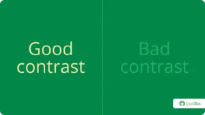
Bad color contrast
Low contrast between text and background is one of the fastest ways to lose a reader. If people have to strain to read, most won’t. Poor contrast also weakens your visual hierarchy, making it harder to see what’s important and what’s secondary.
Good vs Bad color contrast example
No visual flow
A strong infographic guides the eye from one point to the next without the reader having to think about it. When that flow is missing, the design feels scattered, and the reader is left deciding where to look—which often means they stop looking altogether. Use layout, font size, and visual cues to create a clear path through the content.
Random icons
Icons should clarify, not decorate. When they come from different styles, are used inconsistently, or don’t clearly relate to the content, they add distraction instead of meaning. Stick to a cohesive icon set and make sure each one does real work.
- Replace the default slide background with a solid color that gives you enough contrast to work with.
- Use Insert > Shapes and Insert > Icons to build your layout, or Insert > SmartArt for quick lists and process flows.
- Turn on Gridlines and Guides under the View tab to keep everything aligned.
- Add text boxes and charts as needed.
- Export via File > Export or Save As and download as a PDF, JPG, or PNG.
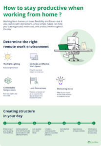
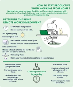
Good vs Bad infographic examples
Not all infographics communicate effectively. Compare the examples below to see what works, what doesn’t, and why.
Good vs Bad infographic examples
| Good example: What works | Bad example: What doesn’t work |
|---|---|
|
|
Frequently asked questions about how to make an infographic
- What makes an infographic effective?
-
Effective infographics tend to share a few qualities:
- They communicate a single, focused message. For example, an infographic on “Five ways to improve remote work productivity” doesn’t detour into unrelated career advice.
- They guide the eye naturally, using visual hierarchy to signal what matters most.
- They use consistent colors, fonts, and icon styles throughout.
- They keep text tight; just enough to support the visuals, not compete with them.
- They use spacing and alignment to make scanning effortless.
- They present accurate, well-sourced information in a way that feels trustworthy and well thought out.
Wondering how to make an infographic visually appealing? Use QuillBot’s AI Image Generator to create custom visuals tailored to your content.
- Do I need design skills to create an infographic?
-
You don’t need advanced design skills to create an infographic. If you’re learning how to make an infographic, focus on structure first—clear hierarchy, consistent spacing, and readable text matter more than complex design techniques. Even simple layouts can work well when the information flows logically and doesn’t overwhelm the reader.
Once your structure is clear, you can also use QuillBot’s Grammar Checker to refine your text and ensure your message is error free.
- What’s the difference between data visualization and an infographic?
-
Data visualizations and infographics are both ways to present information visually, but they serve different purposes.
A data visualization is usually a single chart, map, or graph that helps people explore and interpret the data themselves—often generated automatically with tools like Excel or Tableau.
An infographic, on the other hand, is manually designed to tell a specific story or convey a clear message. It can include one or more data visualizations. Still, it organizes them with text, icons, and narrative elements to guide readers toward a particular insight rather than leaving interpretation entirely up to them.
Wondering how to make an infographic that really works? Use QuillBot’s AI Chat to brainstorm ideas and refine your message.
Cite this QuillBot article
We encourage the use of reliable sources in all types of writing. You can copy and paste the citation or click the "Cite this article" button to automatically add it to our free Citation Generator.
Nikolopoulou, K. (2026, April 08). How to Make an Infographic (Step-by-Step Guide). Quillbot. Retrieved April 10, 2026, from https://quillbot.com/blog/presentations-visuals/how-to-make-an-infographic/