Letter I | Inside the Design of a Simple Letter
The letter I may look like a simple vertical line, but its design possibilities are surprisingly interesting. As the most frequently used vowel in English after E, it’s a structural workhorse that conveys individuality, precision, and elegance. The letter I can also take on many personalities depending on font, texture, and layout.
Understanding the anatomy of the letter I allows you to turn a simple stroke into a powerful visual anchor. This guide explores the history, typography, design variations, and word lists for the letter I, showing how you can leverage this seemingly simple character into a powerful visual element.
QuillBot’s image generator can help you bring a letter I design to life. Simply prompt the tool with details about the shape, texture, colors, and lettering style you’re going for.
Letter I design from QuillBot’s image generator

History of the letter I
The letter I stretches back thousands of years, evolving from an intricate symbol into the sleek vertical form we use today. Tracing its progression offers a unique perspective on how much meaning can be packed into a single line, helping you design with more intent and clarity.
- The Phoenician yodh (1050 BCE): The earliest ancestor of I was the letter yodh (𐤉), which looked like a simplified arm and hand and represented the “y” sound (as in “yes”).
- The Greek iota (800 BCE): The Greeks adopted yodh as iota (Ι) and transformed it into a single vertical stroke to represent the vowel sound in “win.”
- The Etruscan adaptation (700 BCE): The Etruscans adopted the Greek iota, maintaining its straight vertical shape.
- The Roman standard (600 BCE): The Romans incorporated the vertical line into the Latin alphabet. The Romans used I to represent a vowel sound and the “y” sound in “yes.” (Centuries later, the letter J was created to represent the “y” sound, which now represents the “j” sound in English words like “jet.”)
- The Middle Ages (11th–14th Century): During the Middle Ages, scribes used a dense handwriting style called “blackletter.” Because many letters (like U, M, and N) consisted of vertical strokes, the letter I was difficult to see in a word like “minimum.” Scribes began adding a small stroke or dot to help it stand out.
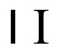
Capital I
When a project includes the letter I or words that start with capital I, you can choose from two variations. Each version has a different impact and purpose.
- Capital I as a single vertical line is sleek, efficient, and unobtrusive. It’s best for minimalist and modern projects and brand identities.
- Capital I with crossbars looks more traditional and academic. The bars help readers to differentiate I from lowercase L or other letters with vertical strokes, so it’s ideal when legibility is critical. This is why schoolchildren are taught this version when they learn to read and write.
Whether you choose a minimalist or crossbar version, these capital I components will help you choose a font or design that fits your creative goals.
- Stem (vertical stroke): The weight (thickness) of the stem determines how delicate or bold the letter feels.
- Crossbars: The horizontal lines at the top and bottom of the stem can have a thicker or thinner weight, depending on the font or design. The crossbars can also be wide for an architectural feel or slim to keep the letter compact.
- Joints: The areas where the crossbars meet the stem can be sharp and angular (90 degrees) for a digital look or feature curved brackets that give the letter a softer appearance.
Capital I
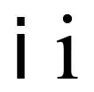
Lowercase I
The most iconic feature of lowercase I is the dot that floats above the vertical stem. This small mark, known as the tittle, can be square or circular depending on the font you’re using. You can also replace the tittle with creative shapes or icons that reflect the theme of a project. Other aspects of lowercase I to consider include:
- X-height: The height of the stem (and other lowercase letters) can be shorter or taller across different fonts, which also affects the placement of the dot.
- Stem: The vertical line can have a heavy, thin, uniform, or tapered weight.
- Air: The vertical space between the top of the stem and the bottom of the tittle varies with different designs and fonts.
Lowercase I
Letter I in different fonts
Subtle differences in fonts and designs affect the mood and impact of the letter I. For example, some fonts use the minimalist capital I, and others use crossbars. When choosing a font or making a custom letter I design, consider these variations.
- Serif or sans serif details: Serif fonts, like Georgia and Lora, usually have crossbars with tapering or brackets. Some sans serif fonts omit the crossbars, while others, such as Lexend and Verdana use crossbars that have a uniform weight. Serif fonts also use embellishments at the top and bottom of lowercase I’s stem.
- Stroke contrast: The relationship between the weight of the crossbars and the stem of the capital I determines the letter’s elegance.
- High contrast: Modern serif fonts use a thick stem and hairline-thin crossbars, creating a luxurious, high-fashion look.
- Monolinear: In slab serifs or most sans serifs, the strokes are the same thickness, suggesting strength and reliability.
- Tittle height: The placement of the tittle can be lower or higher than the cap height of a font. For example, in Georgia and Lexend, the dot sits slightly higher than the crossbars of capital I. The space (aka air) between the stem and the dot also varies.
- Tittle geometry: Some (but not all) sans serif fonts, such as Open Sans and Verdana, use a square rather than a circle. Some decorative fonts even use a diamond or slanted tittle to mimic the angle of a pen stroke.
The following chart illustrates how 10 of the most common fonts handle these features.
| Arial |
Ii |
| Calibri |
Ii |
| Georgia |
Ii |
| Helvetica |
Ii |
| Lexend |
Ii |
| Montserrat |
Ii |
| Open Sans |
Ii |
| Roboto |
Ii |
| Times New Roman |
Ii |
| Verdana |
Ii |
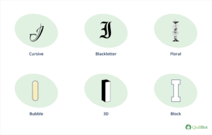
Letter I designs
Because the skeleton of I is so minimal, it acts as a perfect canvas for textures and creative layouts. Whether you’re focusing on the stability of the capital letter or the playful floating dot of lowercase I, these popular styles can elevate a project.
- Block letter I: Characterized by thick, straight lines and uniform stroke widths, block and varsity-style designs are perfect for sports branding, bold signage, classroom displays, and DIY cut-out projects.
- Bubble letter I: Rounded, inflated shapes give the letter I a friendly and approachable feel. In bubble-style designs, the lowercase dot can be a large, playful circle or orb.
- Calligraphy I: This style emphasizes the dramatic contrast between sweeping downstrokes and delicate flourishes. The tittle is often rendered as a sharp diamond or a decorative drop of ink, perfect for luxury branding and stationery.
- Cursive I: Cursive designs feature elegant entry and exit strokes that connect the letter to its neighbors. The capital cursive I often includes a distinctive top loop that sets it apart from other characters.
- Floral I: This style wraps the central stem of the I in organic elements like vines, leaves, or blooming flowers, which works beautifully in personalized gifts and decorations.
- Neon I: Glowing outlines and vibrant colors can mimic the look of neon glass tubes, adding energy to digital graphics and nightlife branding.
- Old English I: Drawing from medieval blackletter traditions, the Old English I uses fractured, heavy strokes and ornamental spikes. Its dense, vertical nature makes it one of the most striking characters in a blackletter alphabet, often used for classic mastheads, tattoos, and medieval-themed designs.
- Patterned I: Filling the stem, crossbars, and dot with decorative textures like polka dots, diagonal stripes, or chevrons adds a playful quality that’s ideal for scrapbooking, nursery decor, and other craft projects where the letter I is the central decorative element.
- Textured I: Using AI tools, you can render an I made of frosted glass, hammered copper, moss-covered stone, or soft velvet, allowing you to preview the look of a physical product or create 3D digital art.
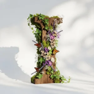
Letter I designs
Floral letter I prompt: A large, architectural capital letter I made of reclaimed dark oak wood, heavily overgrown with a lush arrangement of botanical elements. Intricate climbing ivy, soft green moss, and clusters of small dried wildflowers like lavender and baby’s breath wrap around the stem. A few delicate monarch butterflies are perched on the floral arrangements. White studio background for high contrast.
Letter I from QuillBot’s design generator
Words that start with I
Words that start with I can evoke innovation, independence, or intensity, making them powerful tools for impactful messages. Here are some of the many choices, categorized by length.
- 3-letter words: Ice, icy, ill, ink, inn, ion, its, ivy
- 4-letter words: Icon, idea, idle, idol, inch, info, into, iris, iron, isle, itch, item
- 5-letter words: Icing, ideal, idiom, igloo, image, inbox, index, infer, inlay, inlet, inner, input, irony, issue, ivory
- 6-letter words: Iambic, icebox, icicle, iconic, ignite, ignore, iguana, immune, impact, impala, impart, import, incite, income, indent, indigo, indoor, induct, infamy, infant, influx, inform, infuse, inhale, inject, injure, insect, intact, intake, intend, intern, invade, invent, invest, invite, invoke, iodine, island, italic, itself
- Longer words: Iceberg, identify, identity, illuminate, illusion, illustrate, imagine, imaginary, impeccable, important, incredible, incubate, industry, infinity, influence, inherit, innocent, innovate, interest, internal, interstellar, intuition, inventory, invisible
Words that end in I
Most words that end with I are loanwords, vocabulary borrowed from other languages like Italian or Japanese. Some of them are plural forms of nouns that end in “-s,” such as “cactus” or “nucleus.” Because English words rarely end with I, these words add visual interest to headlines and titles.
- 4-letter words: Chai, deli, kiwi, mini, taxi, wiki, yeti, yogi
- 5-letter words: Alibi, cacti, chili, emoji, fungi, khaki, sushi
- 6-letter words: Alumni, bikini, nuclei, safari, sushi
- Longer words: Broccoli, graffiti, origami, potpourri, spaghetti, stimuli
Other letters of the alphabet
For details about other letters of the alphabet, check out these articles.
| Letter A | Letter F | Letter L | Letter Q | Letter V |
| Letter B | Letter G | Letter M | Letter R | Letter W |
| Letter C | Letter H | Letter N | Letter S | Letter X |
| Letter D | Letter J | Letter O | Letter T | Letter Y |
| Letter E | Letter K | Letter P | Letter U | Letter Z |
Frequently asked questions about the letter I
- What are some adjectives starting with I to describe a person?
-
Some adjectives that start with I to describe a person include:
- Idealistic
- Imaginative
- Impartial
- Incredible
- Independent
- Industrious
- Innocent
- Insightful
- Inspiring
- Intelligent
- Interesting
- Introverted
- Irresistible
Looking for other words that start with the letter I? Ask QuillBot’s AI Chat.
- What are some words that start with I and end in T?
-
Here are some words that start with I and end in T:
- Nouns that start with I and end in T: Inlet, input, islet, infant, insect, insight, idealist, incident, instinct
- Adjectives that start with I and end in T: Important, independent, intact, illicit, instant (can also be a noun), implicit, indirect, inherent, innocent, intelligent
- Verbs that start with I and end with T: Impart, import, indent, indict, induct, infect, invent, invest, imprint (can also be a noun), inhabit, inherent, inhibit, inspect,
QuillBot’s AI Chat can show you more word lists for the letter I or the letter T, such as 5-letter words that start with I and more.
- What is a serif font?
-
A serif font is a typeface that has small decorative lines (called “feet”) at the end of each stroke in a letter. The most common serif font is Times New Roman.
Serif fonts are common in print media (e.g., books and magazines), where they’re more reader-friendly. For example, lowercase letter A is much more distinct from lowercase letter O in a serif font.
When you’re working on creative projects and want to experiment with lettering, QuillBot’s free AI image generator can show you how letters of the alphabet look in serif or sans serif fonts.
- What are some beautiful words that start with L?
-
Some beautiful words that start with L are:
- Luminous (adjective) – Radiating light
- Lavender (noun) – a relaxing color and plant
- Linger (verb) – to stay longer than necessary
- Laconically (adverb) – using few words
- Lyrical (adjective) – expressing emotion in a beautiful way
- Lagoon (noun) – a small lake
- Lucid (adjective) – clear and easy to understand
When writing with these beautiful words that start with the letter L, check that you use them correctly with QuillBot’s Grammar Checker.
Cite this QuillBot article
We encourage the use of reliable sources in all types of writing. You can copy and paste the citation or click the "Cite this article" button to automatically add it to our free Citation Generator.
Routh, N. (2026, March 23). Letter I | Inside the Design of a Simple Letter. Quillbot. Retrieved April 12, 2026, from https://quillbot.com/blog/letters/letter-i/