Brand Guidelines | Components How-To & Examples
Brand guidelines are a set of documented rules that define your visual and verbal brand identity. Sometimes called a “style guide,” brand guidelines make sure your brand stays consistent across all touchpoints.
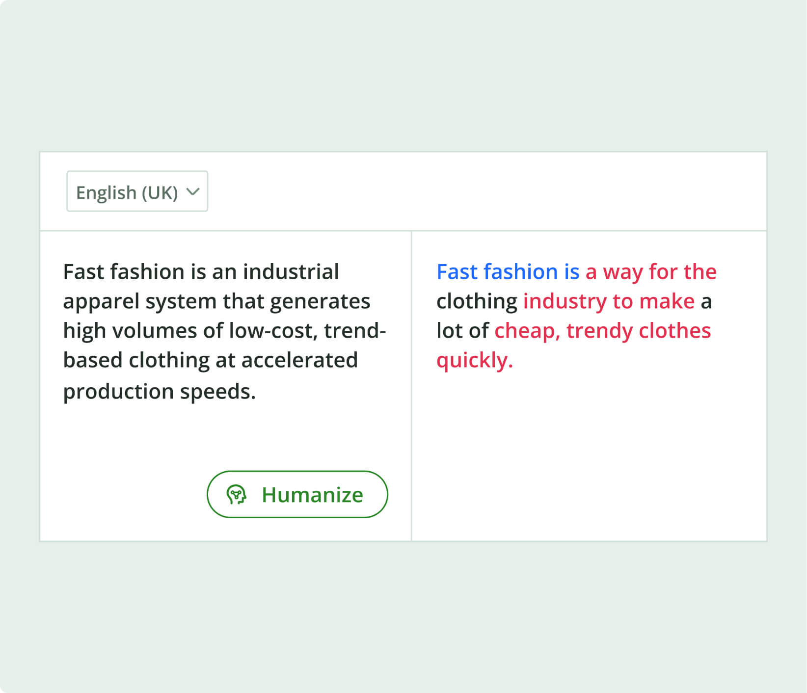
Quillbot’s AI Chat can help you draft your brand guidelines to make sure they’re clear and understandable.
Key takeaways
- Brand guidelines are a structured rulebook that defines how your brand looks, sounds, and communicates, helping you stay consistent across every channel.
- By clearly documenting elements like logo usage, color systems, typography, imagery, and tone of voice, brand guidelines protect your brand identity, improve recognition, and streamline content creation.
- Clear guidelines help teams work faster, collaborate more easily, and maintain quality without constant oversight.
- Creating them involves gathering your brand assets, choosing an accessible format, documenting guidelines clearly, and updating them as your brand evolves.


What are brand guidelines?
Brand guidelines are like an instruction manual for your brand. They don’t talk about how to use your product or services; instead, they explain how to portray and promote your brand across different contexts. For example, brand guidelines will outline exactly how (and how not) to use your logo: sizing, spacing, colors, contrast, and so on.
There are different formats you can use to communicate brand guidelines. Traditionally, they were created as PDFs, but modern brands may choose to use a slide deck or online brand hub instead. Whatever format you choose, it’s important that your brand guidelines be accessible, shareable, and editable.
Why are brand guidelines important?
Brand guidelines are a control system that protect your brand from being fragmented or misrepresented across different channels, teams, and collaborators. Brand guidelines are important because they:
- Enforce consistency: Audiences need consistency in order to recognize and trust your brand. And as soon as more than one person at your brand is creating content, variation creeps in. Brand guidelines standardize how the brand looks, sounds, and behaves so that every touchpoint feels the same.
- Protect brand equity: Even when your brand is well-known, you have to protect its brand equity, or the added value that comes from a well-recognized, respected brand name. If suddenly logos are stretched, colors vary, or messaging shifts, that equity suffers. Brand guidelines act as a safeguard against misuse, especially when working with external partners.
- Agilize your team: Without brand guidelines, your team will probably rethink the basics far more than they need to. Which font should I use in this social media post? What tone of voice should this blog post have? What color logo should I include in my email signature? Brand guidelines answer these questions before your team asks them, removing the burden of decision-making and speeding up production.
- Enable delegation: You can’t scale a business if everything has to be reviewed by one person. Guidelines allow founders, marketers, and content teams to hand off work while maintaining quality and coherence.
- Improve onboarding: New hires or collaborators don’t have to “figure out” the brand by trial and error. They get a clear system: visual identity, tone of voice, messaging principles, and usage rules.
- Support expansion: Brands today exist across websites, social media, email, ads, print, and sometimes physical spaces. And you never know when the next new channel will become imperative. Brand guidelines make it so that no matter what channel you’re working with, your brand translates correctly across formats.
What to include in brand guidelines
People may think brand guidelines just include your logo, color palette, and fonts, but they are actually so much more than that. When considering what to include in brand guidelines, start with these components:
- Summary of brand foundations
- Logo system
- Color palette
- Typography
- Imagery and visual style
- Tone of voice and messaging
- Layout and composition
- Practical applications
Below are examples of each of these elements for the branding guidelines of North & Note, a fictional company that helps remote professionals improve their writing so they can work more effectively with their distributed teams.
Summary of brand foundations
This section sets the scene by summarizing your brand foundations, which tie your brand guidelines to your brand purpose, the reason your brand exists.
Brand foundations include:
- Mission: what you do, for whom, and why that matters now
- Vision: what the brand hopes to become in the future
- Core values: the values your brand “lives” by
- Positioning: who your brand is for and why it makes a difference
- Target audience: the people your brand is trying to reach and influence
- Personality: how your brand would be described if it were a person
These should be defined during your branding process, not when you’re preparing your brand guidelines. In your guidelines, you’re just including a summary to have on reference alongside the rest of the rules for communicating your brand.
Vision: To become a trusted global reference for clear, human-centered workplace communication in an increasingly digital work environment.
Core values:
- Clarity over complexity: communication should be easy to understand on the first read
- Practical usefulness: everything created must be immediately applicable in real work situations
- Respect for the reader: time, attention, and cognitive load should never be wasted
- Continuous improvement: language and communication practices evolve with how people work
Positioning: North & Note is a communication-focused learning platform for remote professionals that bridges the gap between language skill and workplace effectiveness, offering practical writing guidance that goes beyond grammar tools or generic writing advice.
Target audience: Professionals working in international or distributed teams who regularly write in English as a second or additional language. They are comfortable with digital tools, time-constrained, and primarily motivated by improving workplace efficiency and confidence in written communication.
Personality: Clear, calm, and precise. The brand behaves like a knowledgeable colleague who explains things simply without condescension. It avoids jargon, unnecessary complexity, and overly formal language, focusing instead on direct, helpful communication.
Logo system
“Logo system” refers to your actual logo and all the rules about using it. Logo misuse is fairly common, so this is a section you want to make sure is crystal clear. Include:
- Primary logo
- Secondary variations
- Minimum size
- Acceptable color variations
- Incorrect usage examples (e.g., stretching, recoloring, etc.)
Secondary logo: Stacked version of the wordmark: used for square or narrow layouts where horizontal space is limited (e.g., social profiles, app icons, email headers).
Logo mark (icon): A simplified symbol derived from the ampersand shape, abstracted into a directional “north arrow” form combined with a minimal note stem. This version is used as a favicon, app icon, social avatar, or document watermark. It is intentionally minimal so it remains legible at very small sizes.
Clear space: A minimum clear space equal to the height of the letter “N” in the wordmark must surround the logo on all sides. No text, imagery, or graphic elements should enter this space.
Minimum size: Minimum sizes vary depending on context.
- Digital: 24px height for the primary wordmark (absolute minimum)
- Print: 15mm width for the primary wordmark
Below these sizes, the logo mark should be used instead of the full wordmark.
Color usage: The logo should primarily appear in:
- Deep navy (primary brand color) on light backgrounds
- White on dark or photographic backgrounds
Secondary monochrome versions (black or white only) are permitted when color reproduction is not available or when visual simplicity is required. The logo must never be recolored outside the approved palette.
Incorrect usage: The logo must not be altered in any of the following ways:
- Stretching, compressing, or distorting proportions
- Rotating or tilting the mark
- Changing spacing between letters or symbols
- Applying gradients, shadows, or outlines
- Placing the logo on low-contrast or visually noisy backgrounds
- Replacing the typeface with an unapproved font
Background control: The logo must maintain strong contrast against its background. If placed on photography, a subtle overlay or blur must be applied to ensure legibility.
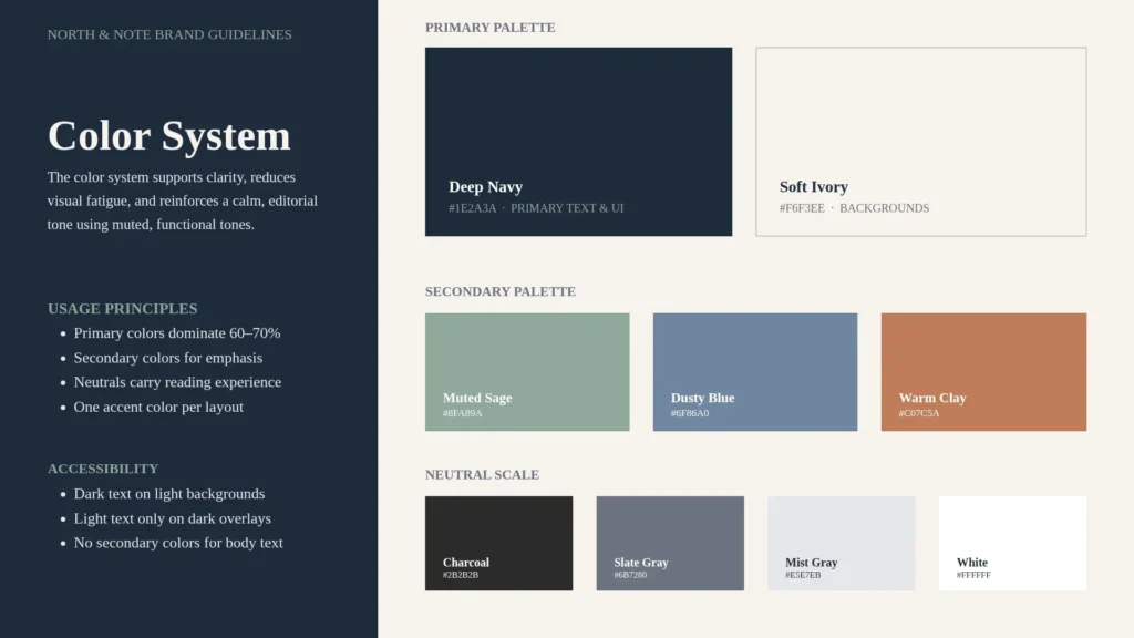
Color palette
Your brand’s color palette isn’t purely a decorative choice. It is a structured communication system that encodes hierarchy, meaning, and behavior into visual form. Given this, it’s important to document color palette rules in your brand guidelines. Include:
- Primary colors
- Secondary colors
- Neutral colors
- Exact values (HEX, RGB, CMYK, Pantone, or values relevant to your brand)
- Usage rules (e.g., backgrounds vs accents)
- Accessibility guidance (e.g., contrast and readability)
Primary palette: These colors define the core brand identity and should dominate key touchpoints (website headers, logos, buttons, and key highlights).
- Deep Navy (HEX: #1E2A3A / RGB: 30, 42, 58): Used for primary text, logo, strong UI elements to anchor the brand with authority and stability.
- Soft Ivory (HEX: #F6F3EE / RGB: 246, 243, 238): Used for backgrounds and editorial layouts to create warmth and reduce screen harshness compared to pure white.
Secondary palette: These colors support hierarchy, emphasis, and section differentiation. They are used sparingly.
- Muted Sage (HEX: #8FA89A / RGB: 143, 168, 154): Used for highlights, tags, and secondary buttons to introduce calm contrast without visual noise.
- Dusty Blue (HEX: #6F86A0 / RGB: 111, 134, 160): Used for links, informational states, and UI accents to support readability while maintaining a restrained tone.
- Warm Clay (HEX: #C07C5A / RGB: 192, 124, 90): Used for callouts, warnings, and emphasis to add human warmth and break the monotony of cool tones.
Neutral scale: Neutrals are the structural backbone of the system. They are used for typography, borders, spacing definition, and background layering.
- Charcoal (HEX: #2B2B2B): Used for primary body text
- Slate Gray (HEX: #6B7280): Used for secondary text
- Mist Gray (HEX: #E5E7EB): Used for dividers, borders, subtle UI structure
- White (HEX: #FFFFFF): Used for contrast surfaces where needed
Usage principles: To keep the system consistent and functional, the following rules apply:
- The primary colors should dominate 60–70% of any composition
- The secondary colors should be used for emphasis, not decoration
- The neutral tones should carry most of the reading experience
- No more than one secondary accent color should appear in a single layout unless explicitly needed for hierarchy
Accessibility and contrast: All combinations must maintain readable contrast:
- Dark text (Deep Navy, Charcoal) should always sit on light backgrounds (Soft Ivory, White).
- Light text should only appear on Deep Navy or sufficiently dark overlays.
- Secondary colors should never be used for body text.
- The Color Palette Generator extracts a color palette from a photo you upload.
- The Color Wheel lets you explore colors according to color theory.
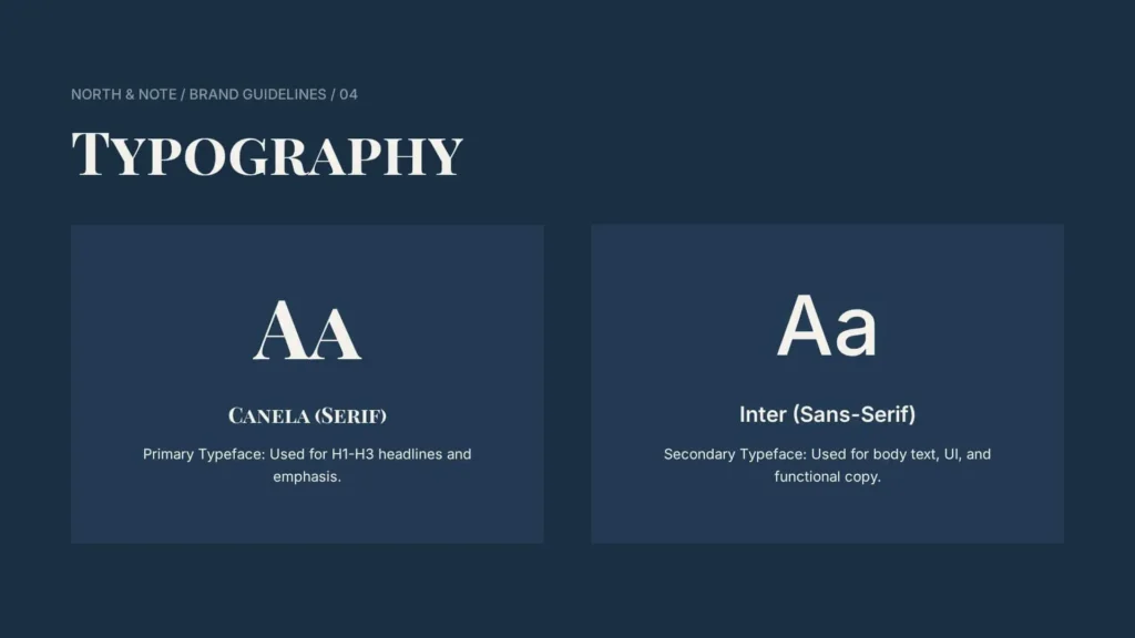
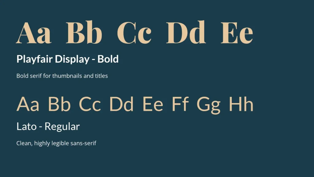
Typography
Typography controls how your brand “reads” visually, both with respect to brand identity and accessibility. Your brand guidelines should include the following about typography:
- Primary and secondary typefaces
- Web-safe alternatives
- Hierarchy (headings, body text, captions)
- Spacing, weights, and usage examples
- H1–H3 only
- No body text use
- Italics are reserved for quotes or emphasis
Secondary typeface (Body + UI): Inter (Sans-serif). Used for body text, UI elements, captions, and navigation. Inter provides clarity and consistency for extended reading and interface use. Rules:
- Body text and interface only
- Never used for headlines in editorial content
Hierarchy (core structure):
- H1: Canela Semibold, large scale
- H2–H3: Canela Regular
- Body: Inter Regular, 16–18px
- Small text: Inter 13–14px
Basic rules:
- Left-aligned text only
- Line length: 65–80 characters for body text
- Strong hierarchy between headings and body
- Minimal use of bold or italics
Functional principle: Typography is treated as a clarity system; Canela defines tone and structure, and Inter ensures readability and usability.
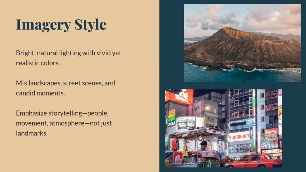
Imagery and visual style
Imagery is one of the most influential parts of a brand system because it operates faster than language. A strong visual style system defines what should be shown, how it should be framed, and what must be excluded. Outline the following when relevant to your brand:
- Overall visual direction
- Subject matter
- Composition rules
- Lighting style
- Color grading
- Human presence
- Object styling
- Background environments
Subject matter:
- People writing, reading, or working quietly
- Close-ups of hands, notebooks, laptops, books
- Simple desk or home workspace setups
Avoid: corporate stock clichés, staged productivity scenes, or overly busy environments.
Composition:
- Simple, often one clear focal point
- Off-center framing with strong negative space
- Clean backgrounds to allow for text or UI overlays
Lighting:
- Natural or soft window light
- Low contrast, no harsh shadows
- Neutral exposure with a calm tone
Color treatment:
- Muted, slightly desaturated palette
- Soft contrast, restrained highlights
- Consistent tone across all imagery sources
Human presence:
- Focus on real activity, not posing
- Neutral, natural expressions
- Partial framing (hands, profiles, cropped views) common
Environment:
- Quiet, uncluttered spaces
- Home desks, small offices, libraries, calm cafés
- No chaotic or high-energy settings
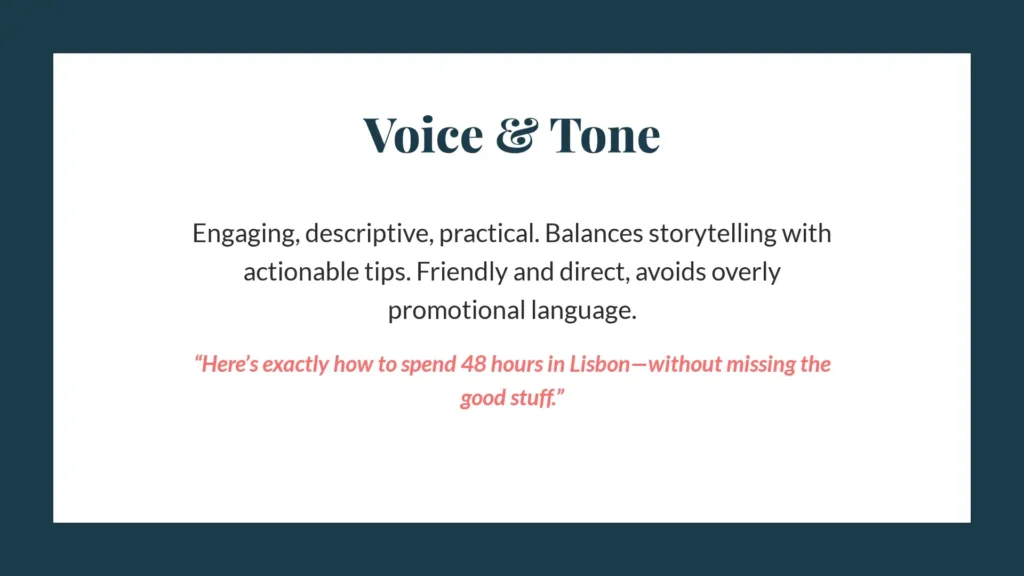
Tone of voice and messaging
Tone of voice and messaging guidelines are critical, especially for content-heavy brands. Tone of voice and messaging pillars are what keep emails, websites, and social posts consistent. Define:
- Core characteristics (e.g., clear, confident, friendly)
- Writing principles (e.g., clarity or friendliness)
- Grammar and style preferences
- Example phrases that are on-brand and off-brand
- Key messaging pillars or value propositions
Core characteristics: The tone is clear, calm, and precise. It avoids unnecessary complexity and focuses on making meaning immediately understandable. It is confident without being assertive or promotional and helpful without becoming overly casual or familiar.
Writing principles: Writing always prioritizes clarity first. Every message should be understandable on a first read, with no need for interpretation or re-reading. Sentences are structured to reduce cognitive load, and ideas are presented in a logical sequence rather than stylistic variation.
Friendliness is expressed through simplicity and respect for the reader’s time, not through informal language or emotional tone. The writing avoids persuasion-driven or sales-heavy language and instead focuses on practical usefulness.
Grammar and style preferences: The style favors short- to medium-length sentences and active voice where possible. It avoids idioms, slang, and culturally specific references that may not translate well across audiences. Punctuation is used conservatively, with minimal use of exclamation marks or stylistic emphasis.
Terminology is kept consistent, and jargon is avoided unless it is necessary and clearly defined. The overall style aims for functional clarity rather than stylistic variation.
Example phrases: On-brand language is direct and functional. For example, “Send the report before Friday” or “This section explains how the system works” reflects the tone accurately. It communicates meaning without additional framing or emotional layering.
Off-brand language includes phrases such as “Kindly do the needful at your earliest convenience” or “Let’s dive into this exciting journey of discovery.” These introduce unnecessary formality or exaggerated enthusiasm that reduces clarity.
Key messaging pillars: The tone supports three core messaging pillars:
- Clarity: Communication should always be easy to understand.
- Efficiency: Writing should help the reader act without confusion or delay.
- Confidence: The brand helps users communicate in professional English without uncertainty or hesitation.
Together, these pillars ensure that every piece of content reinforces the same idea—clear communication is a skill that can be made simple, structured, and reliable.
Layout and composition
This section of your brand guidelines specifies how different elements come together. It addresses the look and feel of your brand with respect to website and content design. You may want to cover:
- Grid systems
- Spacing rules
- Hierarchy and flow
- Alignment principles
- Content density
- Alignment
Grid and structure: Layouts are built on a simple, consistent grid system that ensures alignment across all pages and formats. Content is left-aligned to support natural reading flow, with a clear distinction between elements. The structure avoids overly complex grids or asymmetrical layouts that could disrupt readability. Instead, it relies on predictable spacing and alignment to create a calm, stable visual rhythm.
Spacing system: Whitespace is used deliberately to separate ideas and guide attention. Sections are clearly divided with larger spacing than paragraphs, allowing users to mentally process one idea before moving to the next. Tight spacing is avoided in dense content areas, as it increases visual fatigue and reduces comprehension speed. The overall approach treats spacing as a communication tool rather than a design filler.
Hierarchy and flow: Visual hierarchy is established through size, weight, and spacing rather than decorative elements. Headings are clearly distinguished from body text, and supporting information is visually secondary without competing for attention. The layout guides the reader from top to bottom in a linear, predictable flow. This ensures that key messages are encountered in the intended order, reducing the need for visual scanning or reinterpretation.
Content density: Content is kept intentionally moderate in density. Paragraphs are short, and blocks of text are broken into manageable sections to improve readability. The design avoids overcrowding, ensuring that each section has enough space to be processed individually. This is especially important in long-form content, where sustained attention is required.
Alignment: All elements follow a consistent left alignment, reinforcing readability and structure. Centered or justified text is avoided in body content, as it disrupts reading rhythm and increases visual effort.
Practical applications
It’s also a good idea to include practical applications of your brand guidelines in your brand guidelines. In this section, you could include:
- Social media templates or sample posts
- Website examples
- Email layouts and signatures
- Print materials (business cards, flyers, etc.)
- Presentation templates
- Who’s in charge of the brand guidelines
- When they were last updated
- Who has access and protocol for sharing access
- Preferred file formats and naming conventions
- Where to find assets like logos, images, and templates
How to create brand guidelines
To create brand guidelines, you can generally follow the steps outlined below. If you’re working with a branding agency or consultant, they may have a different workflow from this one.
1. Gather all your branding materials
First, gather all your branding materials. Brand guidelines should be created once your branding is complete; brand guidelines are not the time to complete the branding process. If you haven’t completed branding yet—including strategy and design—take a step back.
If you have worked out the branding for your company or organization, collect all the related materials, including:
- Brand value statement
- Mission statement and defined values
- Audience and positioning details
- Logos
- Color palette
- Typography suite
- Imagery guidelines and/or examples
- Tone of voice profile
Basically, you want to collect all the components of brand guidelines that were listed in the section above.
2. Decide on the format for your brand guidelines
Next, decide how you’re going to format your brand guidelines and where you’re going to host them. A few options are:
- A PDF document
- A shareable presentation
- An online knowledge hub
- A brand management platform
Different solutions will be best for different brands. When making your choice, consider:
- Accessibility: Can internal employees and external collaborators access your guidelines easily?
- Interactivity: Can assets be downloaded right from them, or do users have to look for them in a separate location?
- Maintenance: How easy is it to update your guidelines?
3. Write your guidelines and add assets
Then, write your guidelines. With your branding done, the majority of this information should already be written. But it’s important to review and edit to make sure that your brand guidelines are clear, even for someone who has never interacted with your brand before.
It’s also critical to organize your guidelines with logical hierarchy and flow. Start with the fundamentals—your purpose, mission, values, etc.—and then work through visual and verbal elements. Use headings to divide sections, and use bullet points or tables where necessary to make information easier to consume.
Also, add your assets, like your logo files, any templates, images, etc. These can be added directly into your brand guidelines as images, but make sure you have a clear plan for how your team can access them, too. For example, if you’ve crafted your brand guidelines as a PDF, include a link to the folder where team members can download your logo files.
4. Check for errors and get feedback
Now that you’ve drafted your guidelines, review them to check for any errors. You can use Quillbot’s Grammar Checker to make sure your brand guidelines are free of any spelling and grammar mistakes that could potentially impede clarity.
It’s also a good idea to get feedback. You could ask a few stakeholders from other departments to review your guidelines to see if anything is missing or unclear. You could also send the guidelines to someone who’s generally not familiar with branding—perhaps an intern or a customer support team member—to see if they understand them.
Edit your guidelines according to any feedback your team gives you to make sure the document is as useful as it can be.
5. Share with your team and decide on an implementation date
Finally, share your finished brand guidelines with your team. But don’t just email or Slack them a link to a document. Schedule a meeting so you can present the guidelines, answer questions, and get a feel for their understanding.
Another good idea is to assign your team some branding-related tasks to practice implementing the new guidelines. You can then schedule another meeting or workshop to review results and work through any questions. Encourage team members to write down questions or doubts they have as they go along so you can address them together.
Finally, decide on an implementation date for your brand guidelines. If you’ve already been using the same branding, the brand guidelines may just be a new way to document what you’ve been doing. But if you’ve just branded for the first time or recently gone through a rebranding, it’s important to choose a date when you’ll start publicly following your new guidelines.
For that date, you should:
- Update all email signatures and templates
- Change your website design and digital assets
- Refresh your social media profiles
- Edit your presence in any online directories
- Replace physical materials like posters or fliers
- Make any changes to physical locations
Brand guidelines examples
Below, find a few more fictional examples of brand guidelines. There aren’t complete guidelines for each example, but just a few sections so you can get a feel for what brand guidelines might look like.
Artist with an online shop
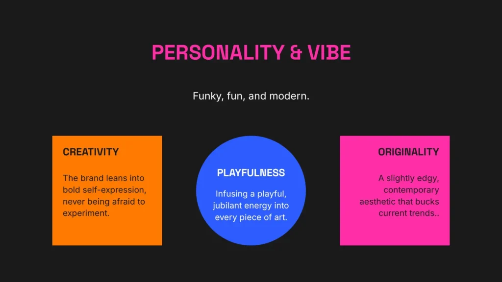
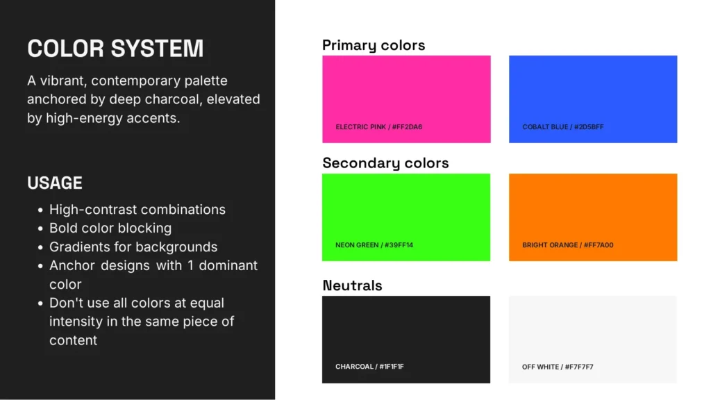
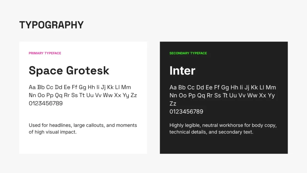
Sophia sells her artworks at local markets and online. As a solopreneur, she did her own branding, created her brand guidelines, and built her website on her own. She defines her brand’s personality as “modern, funky, and fun” and uses playful colors and fonts to communicate this.
Here are excerpts from the brand foundations, color palette, and typography sections of Sophia’s brand guidelines:
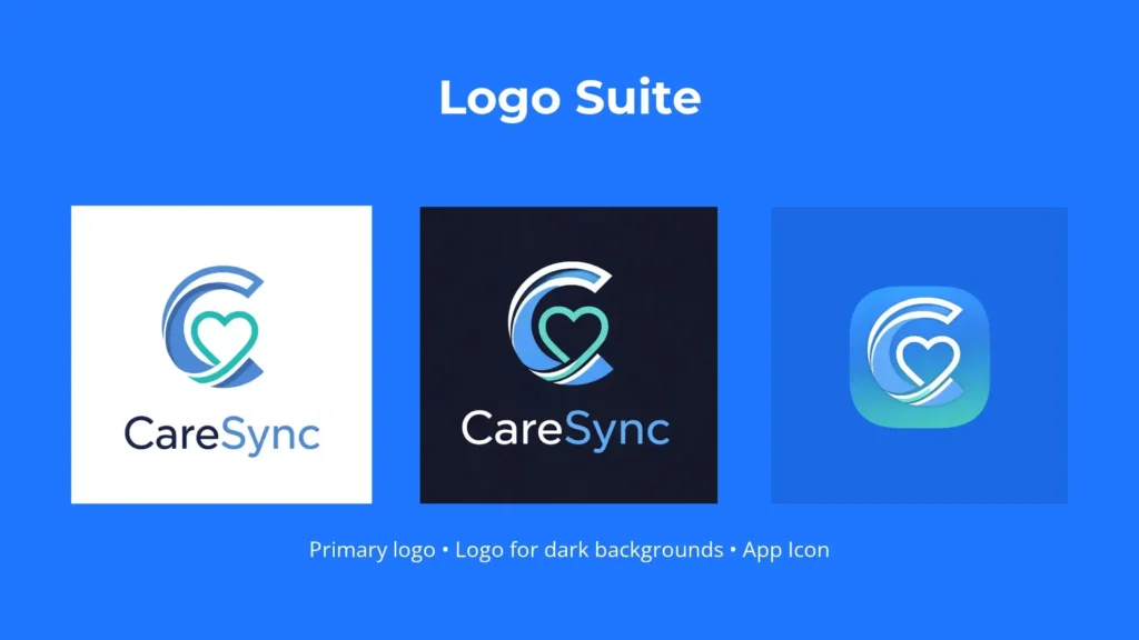
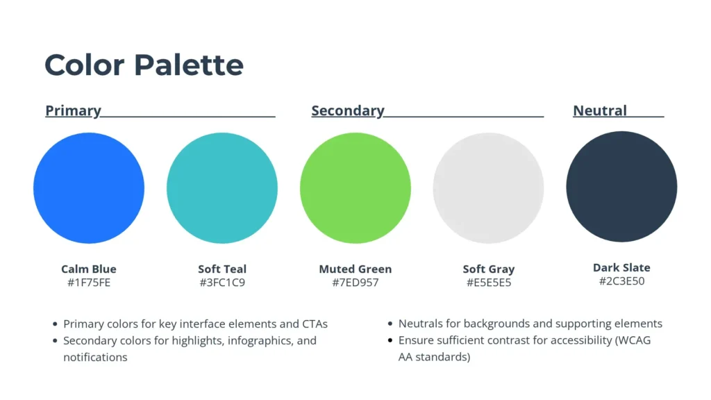
Healthtech SaaS startup
CareSync is a healthtech SaaS startup. It provides telemedicine services and patient scheduling to small clinics. Its mission is to reassure both its clients and their users during interactions about the users’ health. CareSync chooses calm color tones, accessible fonts, and images that promote trust.
A few excerpts from CareSync’s brand guidelines—their logo suite, color palette, and imagery style—follow:

Social media travel creator
Kai is a content creator working in the travel industry. They share destination guides, itineraries, culture insights, and live Q&As across various social media platforms. Kai needs brand guidelines to maintain a consistent identity across platforms and formats as their personal brand expands.
Below are excerpts from the typography, imagery, and tone of voice sections of their brand guidelines:
Frequently asked questions about brand guidelines
- What are brand voice guidelines?
-
Brand voice guidelines are a set of rules that define how your brand communicates verbally across all platforms. Brand voice guidelines outline things like brand personality, values, tone of voice, and messaging pillars.
They are similar but not the same as brand guidelines, which also define your brand’s visual identity. Brand guidelines should include a section on brand voice, though some brands prefer to also have additional, longer brand voice guidelines.
Need help developing your brand voice? Quillbot’s Paraphraser can help you experiment with tone.
- What are digital brand guidelines?
-
Digital brand guidelines are brand guidelines hosted in an online, interactive format. They contain the same elements as traditional brand guidelines but also allow users to download files, copy color codes, etc. right from the guidelines.
Digital brand guidelines are often more accessible and easier to use than traditional guidelines, which may be stored in a PDF or presentation.
If writing digital brand guidelines, make sure they are error-free by using Quillbot’s Grammar Checker.
Cite this Quillbot article
We encourage the use of reliable sources in all types of writing. You can copy and paste the citation or click the "Cite this article" button to automatically add it to our free Citation Generator.
Santoro, K. (2026, April 20). Brand Guidelines | Components How-To & Examples. Quillbot. Retrieved July 27, 2026, from https://quillbot.com/blog/branding/brand-guidelines/