How to Choose the Best Fonts for Presentations
The best font for your presentation is one that’s easy to read, reinforces your message, and suits the context of your topic. Whether you’re designing slides in PowerPoint, Google Slides, or another platform, typography—like color, layout, and other design elements—shapes how audiences absorb and interpret information.
In this guide, you’ll learn how different font types work, which fonts are most effective for presentations, and how to choose and combine them to create clear, engaging slides.
How to choose the best font for your presentation
Before comparing individual typefaces, it’s helpful to understand what makes a presentation font effective. A good choice does more than look appealing—it supports your message and helps your audience stay focused.
- Readability comes first. Choose fonts that are easy to read at a glance. Look for letters that feel clear, not cramped, and make sure there’s enough space between them so words don’t blur together from a distance
- Let the font match the message. Each font has a distinct “personality.” A simple, modern style works well for data-driven or technical topics, while a more traditional look can suit academic or formal presentations. Your font should quietly support the atmosphere you’re trying to create.
- Consider the context. Think about the room, the screen, and the audience. A font that looks crisp on your laptop may feel too thin on a projector, and a style that works for a creative workshop might feel out of place in a corporate boardroom.
- Avoid unnecessary distractions. Fancy, decorative fonts may look interesting up close, but they can make slides hard to read. Use them sparingly—if at all—and only for elements like headers or brief emphasis.
Types of fonts
Fonts fall into several broad categories, each with its own look, personality, and ideal uses.
Serif fonts
A serif is the small stroke or “foot” at the ends of letters. These subtle details give serif fonts a more traditional, bookish feel—the kind often associated with credibility and long-form reading.
| Pros |
|
| Cons |
|
| Best for | Formal presentations, printed materials, and headlines |
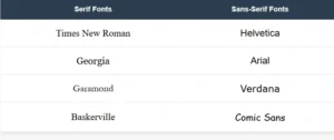
| Examples | Times New Roman, Georgia, Garamond, Baskerville |
Sans-serif fonts
Sans-serif fonts skip the decorative strokes, giving them a clean, streamlined look. They’re widely used in digital environments because their simple shapes hold up well across screens and sizes.
| Pros |
|
| Cons |
|
| Best for | Digital presentations, tech or data-heavy topics, and minimalist designs |
| Examples | Helvetica, Arial, Calibri, Verdana, Comic Sans |
Below are some well-known serif and sans-serif fonts:
Script fonts
Script fonts imitate handwriting or calligraphy, often featuring flowing, connected letters that resemble the natural flow of handwriting.
| Pros |
|
| Cons |
|
| Best for | Titles, quotes, or creative presentations needing a personal touch |
| Examples | Brush Script, Lucida Handwriting, Pacifico |
Decorative fonts
Decorative, or display fonts, have distinctive, stylized designs meant to stand out and grab attention.
| Pros |
|
| Cons |
|
| Best for | Single-word titles or creative, informal contexts |
| Examples | Bauhaus, Ellington, Stencil |
Custom fonts
Custom fonts are unique typefaces created or licensed specifically for a brand or organization.
| Pros |
|
| Cons |
|
| Best for | Branded presentations and maintaining corporate identity |
| Examples | Netflix Sans, Airbnb Cereal |
Which font is best for presentations?
Serif and sans-serif fonts like Times New Roman, Georgia, and Helvetica are standard web fonts—they’re built into nearly every computer and browser, so they display consistently no matter where your presentation is shown.
Script, decorative, and custom fonts are specialty typefaces that most systems don’t have installed by default. When you use these fonts in a presentation, they may not display correctly on other computers unless you embed them (include the font files with your presentation) or use web-based versions.
This is why serif and sans-serif fonts are the safest choices—they’re guaranteed to look the same for everyone in your audience.
If you love a specialty font, consider using it only for titles or key emphasis, and always have a fallback font ready in case it doesn’t display properly.
Top 10 fonts for presentations
With so many fonts available, it can be tricky to pick the one that will best support your message and engage your audience. To help you narrow down your choices, here are some of the most effective fonts for presentations—each selected for its readability, style, and versatility. Below, you’ll find what makes each font work well, along with the settings and presentation types where it performs best.
-
Roboto
Why it’s good: A modern, clean sans-serif designed for excellent legibility on screens and projectors. It balances simplicity with a friendly, professional feel.
Best for: Tech presentations, corporate pitches, educational content, and slides primarily viewed on screens.

-
Open Sans
Why it’s good: Neutral and approachable, with open letterforms that enhance readability across device types and screen sizes.
Best for: Business presentations, webinars, training sessions, and general-purpose professional slides.

-
Montserrat
Why it’s good: A geometric sans-serif with strong, modern shapes that stand out well in headers and titles, giving slides a contemporary feel.
Best for: Creative presentations, design-focused content, marketing pitches, and visually-driven talks.

-
Verdana
Why it’s good: Designed specifically for screen readability, with wide spacing and clear letter shapes that remain legible even from a distance or on low-resolution projectors.
Best for: Large venues, conference presentations, formal events, and detailed reports.

-
Lato
Why it’s good: A warm, versatile sans-serif that blends professionalism with an approachable tone, suitable for both headings and body text.
Best for: Educational content, business reports, internal communications, and client-facing presentations.
![]()
-
Georgia
Why it’s good: A classic serif font optimized for screens, combining a traditional look with strong readability in digital formats.
Best for: Academic presentations, formal events, and legal or policy briefings.
![]()
-
Helvetica
Why it’s good: Clean, neutral, and highly readable, making it adaptable to a wide range of presentation contexts.
Best for: Corporate pitches, professional conferences, branding presentations, and minimalist designs.
![]()
-
Tahoma
Why it’s good: Simple, clear, and tightly spaced, making it a reliable choice for on-screen presentations and slides with substantial text.
Best for: Business reports, technical presentations, training materials, and data-heavy slides.
![]()
-
Arial
Why it’s good: A familiar, widely supported sans-serif that displays consistently across devices, ensuring clean, readable slides.
Best for: General-purpose presentations, quick pitches, and informal or formal business meetings.

-
Calibri
Why it’s good: Modern with soft curves, Calibri is the default font for many Microsoft Office programs, making it highly recognizable and comfortable to read.
Best for: Internal business presentations, educational webinars, client meetings, and standard corporate communication.
![]()
How to choose the right presentation font size
Choosing the right font size is crucial for ensuring your audience can read and absorb your content comfortably—whether they’re sitting close or far away. Font size also helps establish a clear visual hierarchy, highlighting what’s most important on each slide. In this section, you’ll learn how to pick sizes that work well for different room sizes, screen types, and presentation styles.
Font size and hierarchy
Visual hierarchy uses size differences to guide viewers through your slides. Titles should be noticeably larger to draw attention, while subheadings and body text get progressively smaller. This contrast helps the audience quickly understand the structure and focus of each slide without confusion.
Font size general guidelines
- Titles: Aim for 36–60 pt depending on room size and slide content.
- Subheadings: Usually 24–40 pt, enough to create clear separation from titles and body text.
- Body text: Keep it no smaller than 18 pt to avoid strain, but adjust upward for larger rooms.
- Captions or footnotes: Use sparingly and keep at least 12–16 pt; smaller sizes can be hard to read.
Font size alone doesn’t create structure. Combine size with weight (bold vs. regular), spacing, and layout to guide readers’ attention smoothly:
- Use bold or a larger size for key points or headlines.
- Keep line spacing generous and avoid cramping bullet points or paragraphs. Tight lines make text hard to scan.
- Use bullet points or short lists instead of dense paragraphs—they’re easier to digest and more visually appealing.
Venue considerations
Where you’re presenting makes a big difference. In small rooms or meetings, font sizes can be smaller since viewers are closer to the screen. In larger venues or auditoriums, increase font sizes to ensure legibility from a distance. Keep in mind that projectors and different screens can also affect clarity, so always test your slides in the actual space if possible.
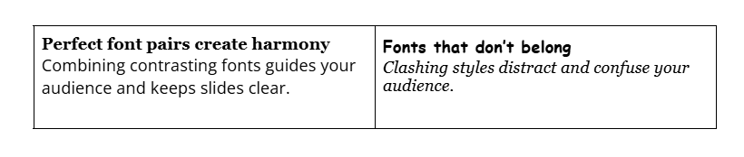
Pairing fonts
Choosing the right font combinations can make your presentation more engaging and easier to follow. Good pairing creates contrast and harmony without overwhelming your slides. Here are a few points to keep in mind:
- Limit yourself to two font families to keep slides clean and consistent.
- Combine fonts with different styles, like a serif headline with a sans-serif body, for clear separation (contrast pairing).
- Use fonts with similar proportions or neutral tones for a balanced look (complementary pairing). For example, Helvetica and Times New Roman.
- Vary font weights within one family to create hierarchy—bold for titles, regular for text, light for captions.
- Avoid pairings that clash or compete (e.g., Comic Sans with Trajan Pro) or fonts that are too similar (e.g., Arial and Helvetica).
- Test your pairings across all slide types to ensure consistency and readability.
Good vs Bad font pairing example
Frequently asked questions about best font for presentation
- How do I choose the right font size for a presentation?
-
Choosing the right font size ensures your text is easy to read from anywhere in the room without cluttering your slides.
Generally, keep body text at least 18–24 points and use larger sizes for titles and headings to create a clear visual hierarchy. Also, consider your presentation setting—smaller rooms allow for smaller text, while large venues need bigger fonts.
If you need help selecting the perfect font sizes, try QuillBot’s AI presentation maker, which lets you design clear, professional slides with balanced typography.
- Can I use multiple fonts in one presentation?
-
Yes, but it’s best to limit yourself to two font families to keep your slides cohesive and easy to read. Using one font for headings and another for body text creates contrast without distraction. To simplify this process, QuillBot’s AI presentation maker offers professionally designed templates with thoughtfully paired fonts, helping you maintain consistency and style throughout your presentation.
- Should I use serif or sans-serif fonts in a presentation?
-
Both can work, but sans-serif fonts are usually the safer choice for presentations. Their clean, simple shapes stay crisp on screens and projectors, making them easier to read from a distance. Serif fonts can still be effective for titles or more formal topics, but thin serifs may disappear on low-resolution displays.
If you’re not sure which option suits your deck, QuillBot’s free AI presentation maker provides templates with pre-paired, presentation-safe fonts so you can experiment and see what works best for your topic.
Cite this QuillBot article
We encourage the use of reliable sources in all types of writing. You can copy and paste the citation or click the "Cite this article" button to automatically add it to our free Citation Generator.
Nikolopoulou, K. (2025, December 01). How to Choose the Best Fonts for Presentations. Quillbot. Retrieved March 3, 2026, from https://quillbot.com/blog/ai-writing-tools/best-font-for-presentation/