Using a Color Wheel to Choose Brand Colors
So you’ve found a color that encapsulates your brand—perhaps it’s a fresh green to hint at sustainability, a deep blue to evoke trust, or a refined teal to help you stand out from the crowd.
A color wheel tool, like QuillBot’s free color wheel, can help you expand on that signature color to build a palette you can use consistently across your website, social posts, flyers, and other brand materials.
This article will show you a simple method for generating a five-color palette you can use as a foundation for your project’s branding design, using a color wheel and some basic color theory.
Brand color palette
A brand color palette is a set of colors you use repeatedly so people start to recognize your communications as “you.” It’s useful to think of the individual colors of a brand palette in terms of their roles. For instance, when building a simple five-color palette, a practical approach is to choose two main colors, an accent color, and two neutral colors:
- Main colors: your signature color plus a strong partner color
- Accent color: a color that stands out next to your main colors to use sparingly to grab attention (e.g., for buttons, badges, icons, or key highlights)
- Neutral colors: quieter supporting colors (e.g., for backgrounds, sections, and structuring layouts)
Tools such as QuillBot’s color wheel are a helpful starting point for choosing your brand colors because they let you explore color harmonies—color groupings based on their positions relative to one another on the wheel.
Color harmonies
In QuillBot’s color wheel tool, you pick your base color by either moving the pointer inside the wheel or entering a hex color code. You can then view the color harmonies of this base. Use the drop-down menu to see its:
- Complementary color: the color opposite your base color on the wheel (high contrast)
- Analogous colors: nearby colors (harmonious and cohesive)
- Triadic colors: three evenly spaced colors (balanced contrast, lively feel)
- Tetradic colors: two complementary pairs forming a rectangle (more variety and contrast)
- Square scheme: four evenly spaced colors (high energy and variety)
Think of these harmonies as options to explore and fine-tune rather than “correct” combinations.
Once you’ve found a possible candidate for one of your brand colors, you can make it lighter and softer by moving the pointer toward the center of the wheel. The outer ring acts like a shade control—moving its pointer makes the selected color darker.
Main brand colors
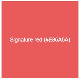
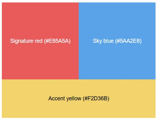
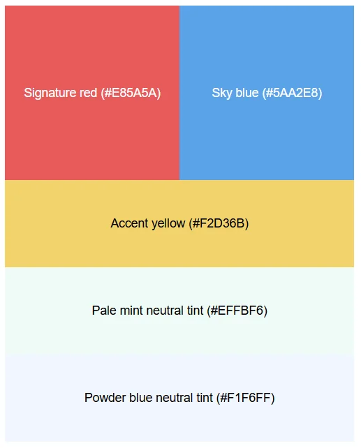
Let’s say you’re creating a brand palette for a kids’ soccer camp, and you’ve already identified the hex code of a red that you’d like to use as your “signature” color (#E85A5A).
Next, you look for a second main color that contrasts well without looking harsh or jarring.
One reliable approach is to use a color from your signature color’s split-complementary scheme. Here’s the idea:
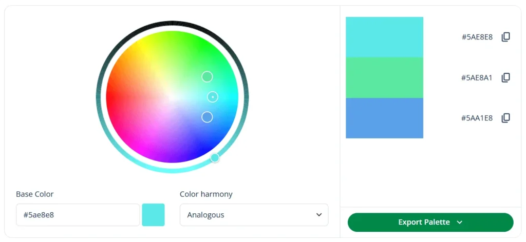
- First, find the complementary color of your signature color (the one opposite it on the wheel)—in this case, a bright aqua (#5AE8E8).
- Then, instead of using that exact opposite, choose one of the two colors next to it on the wheel—in this case, the analogous colors of that aqua.
Split complements often keep the contrast while feeling slightly less “harsh” than a direct complementary pair.
Using QuillBot’s color wheel, you identify the split complements of your signature red as a fresh seafoam green (#5AE8B2) and a sky blue (#5AA2E8).
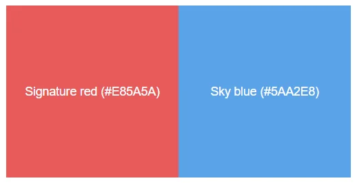
You decide to go for the blue as your second main color. Used in the right proportions, these two main colors are fun and energetic while still being easy to read on screens and print materials.
Supporting brand colors
Now that you have your two main colors, it’s time to select the three supporting colors. You want:
- One accent color you can use to grab attention (e.g., for “Book now” splashes or icons)
- Two neutral colors for subtle backgrounds and balance (e.g., for panels behind text or structuring layouts)
Contrasting color harmonies
To find an accent color that stands out, you explore higher-contrast harmony options like tetradic and square using QuillBot’s color wheel.
The tetradic colors of your signature red are a bright aqua (#5AE8E8), an indigo (#5A5AE8), and a sunny yellow (#E8D85A).
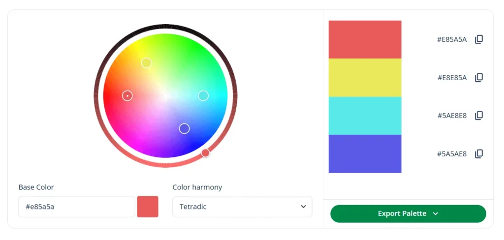
For a kids’ soccer camp, you like the yellow as your accent because it signals optimism and energy and pops strongly against both main colors (red and blue).
But at full intensity, the yellow could feel a bit sharp, so you refine it by dragging the color wheel selector slightly toward the center to make it a touch softer and more usable in UI elements and print. Your final accent yellow becomes #F2D36B.
Neutral colors
Finally, you need two neutrals as gentle background colors that still feel connected to your main palette. One way of selecting these is to take existing colors from your palette (or nearby harmonies) and move toward the center of the wheel to create very pale tints.
For the first of your two neutral colors, you use QuillBot’s color wheel to produce a tint of the seafoam green you already identified as a split complement of your signature red. For the other, you go for a tint of the sky blue that you chose as your second main color.
That gives you two soft neutrals that feel “on-brand” (because they’re related to your harmony choices) without competing with your main colors:
- A pale mint neutral (tint of seafoam): #EFFBF6
- A powder blue neutral (tint of sky blue): #F1F6FF
You now have a basic palette that you can develop by testing the colors in real layouts and in both screen and print, checking contrast and accessibility (e.g., making sure text, buttons, and links remain easy to read against their backgrounds), and adjusting the tints/shades to improve readability and balance.
Frequently asked questions about choosing brand colors
- What meanings do brand colors have?
-
Brand colors tend to carry common emotional associations or meanings that shape how people interpret your brand at a glance.
For example, blue often suggests trust and reliability, green can imply nature or growth, red can feel energetic and bold, and yellow can feel optimistic and playful.
These meanings aren’t universal—culture, industry, and context matter—but choosing colors intentionally helps you signal the right “vibe” and stay consistent across your website, social posts, and other materials.
Choosing your brand colors and found an inspiring image? Upload it to QuillBot’s free online color palette generator to extract its color palette.
- How can I use color harmonies to choose brand colors?
-
You can use color harmonies as a starting point for choosing brand color combinations that feel balanced and intentional.
Enter one of your brand color candidates into QuillBot’s free online color wheel to view its complementary, analogous, triadic, tetradic, and square color schemes—complete with their hex color codes.
Cite this QuillBot article
We encourage the use of reliable sources in all types of writing. You can copy and paste the citation or click the "Cite this article" button to automatically add it to our free Citation Generator.
QuillBot. (2026, February 16). Using a Color Wheel to Choose Brand Colors. Quillbot. Retrieved February 20, 2026, from https://quillbot.com/blog/image-tools/choosing-brand-colors/