How to Find Complementary Colors on a Color Wheel
Technically speaking, complementary colors aren’t colors that necessarily look good together; they’re colors that are opposite each other on a color wheel. They contrast strongly and “neutralize” each other if mixed, shifting toward dull grays or browns if you’re using paints or toward colorless grays or white if the colors are produced with light (e.g., on a computer display).
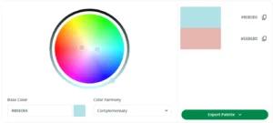
You can find complementary colors using an online tool like QuillBot’s free color wheel—all you need to do is enter a hex code (e.g., #B0E0E6 for a pastel blue) and select “Complementary” from the color harmony drop-down menu.
What are complementary colors?
In color theory, complementary colors are pairs of hues that sit opposite each other on a color wheel. When placed side by side, complementary colors create strong contrast and tend to make each other look more vivid.
So “complementary” describes the color-wheel relationship between hues and doesn’t necessarily mean that they will look “nice” together. How the pairing feels depends a lot on lightness (how light/dark a color is) and saturation (how intense/muted it is).
Exactly what the complementary color of a particular hue is depends on the color wheel you’re using. For example, complementary pairings of the primary colors on a traditional artist’s color wheel are:
On a light-based color wheel for screens (like QuillBot’s color wheel, where the primary colors are red, green, and blue rather than red, yellow, and blue), the equivalent pairings are:
- Red and cyan (a hue between blue and green)
- Green and magenta (a purplish-pink)
- Blue and yellow
For many purposes, it’s enough to think in terms of color families: blues pair with oranges, reds with greens, and so on.


Characteristics of complementary colors
Complementary colors matter because they’re one of the simplest ways to create clear, intentional contrast—useful in everything from a logo to a classroom poster to a living-room color scheme.
- Contrast effect: Complementary pairs naturally stand apart, which helps elements feel distinct (great for calls to action, headlines, signs, and visual aids).
- Pop effect: Putting complements together tends to make both hues appear more intense—often described as colors “popping.”
- Energy effect: At high saturation, complementary combinations can feel vibrant and attention-grabbing—great for emphasis, but overwhelming if overused.
- Warm–cool effect: Many complementary pairs create a pleasing tension between warm and cool tones (like blue and orange).
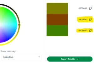
Split complementary colors
Split complementary colors are a variation on complementary colors: you take one base hue, find its complement on the color wheel, then use two analogous colors on either side of that complement (i.e., two “neighbors” of the complement) to build a three-color scheme.
This keeps the “opposite-side” contrast but usually feels a bit less intense than using the direct complement.
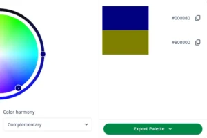
This gives you a split scheme comprising your starting color, which was navy blue (#000080), a deep orangey brown (#804000), and a vivid olive green (#408000).
Double complementary colors
Double complementary colors (also called a tetradic or rectangle color scheme) use two complementary pairs—four hues that form a rectangle on the color wheel.
To create a double complementary scheme using a particular color:
- Select a second color by choosing a hue that’s near to your starting color on the color wheel (an adjacent/analogous hue)
- Now add the complement of your starting color and the complement of your second color (the hues opposite them on the wheel).
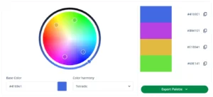
For instance, if you enter the color code #4169E1 for the CSS color name RoyalBlue, QuillBot’s color wheel will produce a tetradic (double-complementary) scheme with the additional colors:
- A bright purple (#B941E1)—a “neighbor” of the royal blue when you move clockwise on the wheel)
- A golden yellow (#E1B941)—the complementary color of the royal blue
- A bright green (#69E141)—the complementary color of the bright purple
Double-complementary schemes tend to be high-contrast, so they typically work best when you carefully control proportions (e.g., choose one dominant color and three supporting colors) and fine-tune the palette with adjustments to lightness and saturation (intensity).
This is how you make adjustments on the QuillBot color wheel:
- Adjust hue by moving the pointer clockwise or anticlockwise (e.g., shifting a yellow toward orange or toward green).
- Make a color paler and more pastel (less saturated) by moving the pointer toward the center of the wheel.
- Make a color lighter or darker using the control on the outer ring
Frequently asked questions about complementary colors
- What are complimentary colors?
-
Complimentary colors is a common misspelling of complementary colors.
“Complimentary” (with an “i”) means “free of charge” (e.g., “complimentary tickets”) or “congratulatory” (e.g., “She was very complimentary about your project”).
“Complementary” (with an “e” means “good together” (e.g., “Mint and chocolate are complementary flavors”).
“Compliment” and “complement” also have different meanings.
Use QuillBot’s free Grammar Checker to pick up errors with commonly confused words in your writing.
- What is the difference between complementary colors and analogous colors?
-
Complementary colors are opposites on the color wheel (like blue and orange on a traditional color wheel), so they typically create strong contrast and often make each other look more vivid.
Analogous colors are neighbors on the color wheel (like blue, blue-green, and green), so they usually create a more harmonious, blended look with lower contrast.
In practice: use complementary colors when you want something to stand out, and analogous colors when you want more cohesive combinations.
You can use QuillBot’s free color wheel to create complementary and analogous color schemes.
- What is a complementary colors generator?
-
A complementary colors generator is another term for a color wheel tool that can show you a color’s harmonies (e.g., its complementary color).
Enter a color code into QuillBot’s free online color wheel to see its complementary, analogous, triadic, tetradic, and square colors.
- What are the complementary colors to green?
-
In color theory, the complementary colors to green include green’s direct complementary color, as well as the colors in its split complementary and double complementary (tetradic) schemes.
The complementary color to green (direct opposite on the wheel) is:
- Red (using a traditional artist/RYB wheel)
- Magenta (using a RGB/screen-based wheel like QuillBot’s free online color wheel tool)
The split complementary colors to green (two neighbors of the
complement) are:- Red-orange and red-violet if the complement is red on your wheel
- Pink/red-magenta and violet/purple-magenta if the complement is magenta on your wheel
You get the double complementary (tetradic) colors to green by:
- Picking a second hue next to green on the wheel (like yellow-green or blue-green)
- Then finding the complements of both (e.g., the complements of green and blue-green are red and red-orange—or the equivalents on your wheel)
- What are the complementary colors to blue?
-
In color theory, the complementary colors to blue include the direct complementary color of blue, as well as its split complementary and double complementary colors.
The complementary color to blue (its direct opposite on the wheel) is:
- Orange (using a traditional artist/RYB wheel)
- Yellow (using a RGB/screen-based wheel such as QuillBot’s free online color wheel tool)
The split complementary colors to blue (two neighbors of the complement) are:
- Yellow-orange and red-orange if the complement is orange on your wheel
- Yellow-green and yellow-orange if the complement is yellow on your wheel
You get the double complementary (tetradic) colors to blue by:
- Picking a second hue next to blue on the wheel (like blue-green or blue-violet)
- Then finding the complements of both (e.g., the complements of blue and blue-green are orange and red-orange—or the equivalents on your wheel)
Cite this QuillBot article
We encourage the use of reliable sources in all types of writing. You can copy and paste the citation or click the "Cite this article" button to automatically add it to our free Citation Generator.
QuillBot. (2026, February 18). How to Find Complementary Colors on a Color Wheel. Quillbot. Retrieved April 6, 2026, from https://quillbot.com/blog/image-tools/complementary-colors/