Color Theory | Definition & Color Wheel
In art, design, and visual communication, color theory explores questions like:
- What colors look good together—and how you can use color wheels, like QuillBot’s color wheel, to find harmonious color combinations
- How individual colors and color palettes can express meaning, shaping mood and emotion
- How to alter a color’s hue (e.g., shift a blue toward teal or purple)
- How to make colors appear more or less bright
- Why colors can look different depending on the colors around them
- How lighting conditions affect our perception of color
- How color choices can improve readability and clarity
- How to keep colors consistent across digital and printed media


What is color theory?
Color theory is a set of concepts that helps us use color purposefully in art and design projects—covering how colors mix, how they contrast, and which combinations tend to look harmonious. It also explains how color choices can shape mood and meaning, such as why certain palettes feel calm, energetic, serious, or playful.
Learning about color theory involves understanding how you can use the color wheel to create color schemes as well as the effects of altering key color properties such as hue, saturation, and value (brightness). Other practical topics in color theory include why colors can look different in different lighting conditions and alongside different colors, and how to keep colors consistent from screen to print.
Color theory basics
By learning the basics of color theory, you’ll understand how to choose colors that work well together and how changes in hue, saturation, and value can alter a design’s mood and clarity.
The color wheel
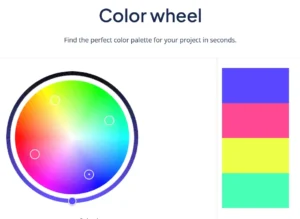
A color wheel is a circular map of colors that helps you see how different hues relate to each other—like which colors sit next to each other for smooth, harmonious palettes, and which colors sit opposite each other for strong color contrast. Designers and artists use these relationships to create palettes, achieve clarity and emphasis by managing contrast in lightness and color, and anticipate what happens when mixing paints.
Color wheels are built around different “color systems,” depending on whether you’re working with pigments (paint/ink) or light (screens). Two common wheels you’ll encounter are the traditional RYB wheel, which is often used in art classes, and the RGB, which is used for screen-based color (digital light).
The traditional color wheel
The Red–Yellow–Blue (RYB) color wheel is the classic wheel you learn about in art classes. It’s the traditional teaching wheel for pigment mixing, where combining pigments often produces a darker, duller color because the mixture absorbs more light overall.
- Best for: Painting, pastels, inks, and other physical media
The RGB color wheel
Red–Green–Blue (RGB) color wheels, such as QuillBot’s color wheel tool, reflect how colored light works—the pixels on phone displays, computer monitors, and TVs, for instance. Here, mixing colors adds light, and combining all three “channels” at full intensity produces white (not black).
- Best for: Digital design, screen-based user interfaces (UI), video, and digital photography
If you’re designing for print, you’ll usually create colors on-screen (RGB) but later convert to a print color model (e.g., CMYK) for printing.
Warm vs cool colors
Most color wheels are arranged so warm colors cluster on one side and cool colors cluster on the other, with a gradual transition between them. Reds, oranges, and yellows typically sit on the warm side, while greens, blues, and purples usually sit on the cool side (though some yellow-greens and red-purples can feel warmer).
Warmer colors like amber often tend to feel more energetic, cozy, or attention-grabbing, whereas cooler colors like light blue tend to feel calmer, more distant, or soothing. Thinking in terms of temperature is useful when you want a palette to stay consistently warm or cool—or when you want extra contrast by mixing warm and cool tones.
Hue
You can think of hue as the basic “type” of color—what we usually mean when we say “red,” “blue,” “green,” or “purple.” On the QuillBot color wheel, hue is what changes as you move the pointer around the circle.
Small shifts in hue can change the feel of a color while keeping its lightness and saturation roughly the same. For example, a blue can lean toward green (teal) or toward purple (indigo). Small hue shifts help you choose neighboring hues to include in a palette, which adds natural variety and depth.
Saturation
Saturation describes how intense or muted a color looks.
- High saturation: Vivid, bold, rich color (e.g., navy blue)
- Low saturation: Muted, dusty (e.g, pastel blue)
Saturation is a big part of how a palette feels. Highly saturated palettes tend to feel energetic and playful, while low-saturation palettes often feel refined, subtle, or serious.
Value
Value (also called lightness) describes how light or dark a hue is.
- High value = lighter (closer to white)
- Low value = darker (closer to black)
Value is especially important for readability and clarity. Two different hues can still be hard to tell apart if they’re similar in value. For example, two strong colors with the same value can “blend” visually at a distance.
To create depth and hierarchy, you can use small value shifts between areas of your design (slightly lighter or darker tones) and reinforce them with shading or shadow.
Color schemes
You can use color wheels, such as QuillBot’s color wheel, to help you build color schemes (color harmonies)—sets of colors selected by their positions on the wheel.
Complementary colors
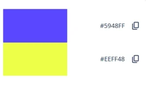
Complementary colors sit opposite each other on the wheel (e.g., blue and yellow on QuillBot’s color wheel).
- Look/feel: Bold, high contrast, energetic
- Common use: Make focal elements pop by using a complementary color as a small accent.
- Watch out for: Two highly saturated complementary colors can feel harsh if both are used as main colors.
Analogous colors
Analogous colors sit next to each other on the color wheel.
- Look/feel: Smooth and cohesive
- Common use: Calm palettes, gradients, illustrations and graphics, backgrounds
- Watch out for: Can feel flat if the colors are too similar in lightness.
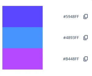
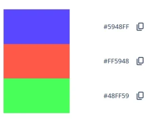
Triadic colors
A triadic scheme uses three hues spaced evenly around the wheel (e.g., red, green, and blue on QuillBot’s color wheel).
- Look/feel: Vibrant but balanced
- Common use: Playful designs, infographics/diagrams, and accent colors for user interfaces
- Watch out for: Can look chaotic if all three are used as main colors, so it works best to choose one dominant color and use the other two as accents.
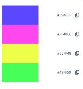
Tetradic colors
A tetradic scheme uses four colors arranged as two complementary pairs (often shown as a rectangle on the wheel).
- Look/feel: Rich and varied
- Common use: Complex illustrations, bold brand systems
- Watch out for: With four strong hues, it’s easy for everything to compete for attention and feel busy—try letting one color lead, keeping two colors lower-saturation and/or closer in value, and using the fourth as a small accent.
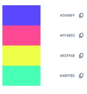
Square colors
A square scheme uses four colors evenly spaced around the wheel.
- Look/feel: High variety and hue contrast
- Common use: Colorful, dynamic palettes
- Watch out for: Can feel busy—try using one main color, one as a secondary color, and reserving the other two for small accents.
Primary colors
Which colors count as primary depends on the color system you’re using.
- In the traditional RYB model taught in many art classes, the primary colors are red, yellow, and blue.
- In RGB (the additive color system used for screens and digital light), the primaries are red, green, and blue.
- In most print workflows, color is separated into CMYK: cyan, magenta, and yellow (subtractive primaries), plus black (the “key” color) for stronger darks and detail.
Frequently asked questions about color theory
- How can I use a color wheel to build a palette?
-
You can use a color wheel like QuillBot’s color wheel tool to build a palette of colors whose hues have a color theory relationship—such as complementary, analogous, triadic, tetradic, or square colors.
Start by entering your base color (usually a HEX code). The tool will suggest related colors and provide their color codes. Then refine the palette by adjusting lightness (value), saturation, and how much of each color you use—often with one main color, one supporting color, and one or two accents.
Found a color palette you love in a photo or design? Upload the image to QuillBot’s free color palette generator to find out the colors it’s using.
- How do you change the hue on a color wheel?
-
On an online RGB color wheel like QuillBot’s color wheel tool, you change the hue by moving the selector around the circle (rather than from inside to outside).
Going around the circle shifts the color family (red → orange → yellow → green → cyan → blue → purple → back to red).
Seen a design with a palette you want to use as inspiration? Drop the image into QuillBot’s free color palette generator to identify the colors in its palette.
Cite this QuillBot article
We encourage the use of reliable sources in all types of writing. You can copy and paste the citation or click the "Cite this article" button to automatically add it to our free Citation Generator.
QuillBot. (2026, March 08). Color Theory | Definition & Color Wheel. Quillbot. Retrieved March 19, 2026, from https://quillbot.com/blog/image-tools/color-theory/