Color Palettes | How-To Guide With Examples
Color palettes help create a cohesive design or brand identity by bringing together colors that convey a particular mood, style, or personality, work well together visually, and serve specific design roles.
This article provides practical tips for creating a color palette, including insights from color theory, illustrated with a variety of example palettes.
To use the colors in an inspiring image as the starting point for your own palette, upload it to Quillbot’s free Color Palette Generator to identify the color codes.
Key takeaways
- A color palette is a selection of colors that work together to create a cohesive visual design or brand identity.
- When creating a color palette, consider the mood or style you want to convey, the number of colors you need, and the role each color will play.
- Color theory can help you select colors that harmonize or contrast, including analogous, complementary, and monochromatic combinations.
- The proportions in which you use colors can significantly affect the overall look and feel of a design. The 60-30-10 rule is one guideline for achieving visual balance.


Creating a color palette
The tips below will help you select, combine, and balance colors to create a cohesive palette for your project.
Mood or style
Start by considering the mood or visual style you want your color palette to convey. For example, palettes featuring soft colors like pastel blue can create a gentle, calming effect, while bright, saturated colors like hot pink can convey energy and playfulness. Earthy colors like olive green can produce a natural, grounded feel, while dark colors combined with metallic accents in colors like silver and rose gold can suggest elegance and luxury.
Number of colors
There’s no fixed number of colors that a palette should contain. A simple palette might have just three colors, while more complex designs may call for a larger selection.
Too many colors can make a design feel cluttered and visually inconsistent, while too few can limit your options for creating contrast and visual variety. You can always add more colors as your design develops, supplementing a palette with lighter and darker variations of your main colors, for example.
Roles of each color
Colors within a palette often serve different purposes, commonly described using the following terms:
- Primary or dominant color: Establishes the main visual character of the design
- Secondary colors: Important colors that support the dominant color and provide variety
- Accent colors: Colors used to draw attention to specific design elements or create points of visual interest
- Neutral colors: Colors that serve as backgrounds, create visual separation, or soften the overall effect of more vibrant colors
Color relationships
When selecting colors for a palette, it’s useful to consider the visual effects of combining colors with different relationships on the color wheel:
- Analogous colors: colors that sit next to one another on the color wheel to create a harmonious effect
- Complementary colors: colors from opposite sides of the color wheel to create strong hue contrast and visual dynamism
- Monochromatic colors: variations of a single hue in lightness and color intensity to create a cohesive, unified look
Understanding color relationships can help you choose secondary colors that harmonize or contrast with your dominant color, as well as accent colors that stand out.
Balance
You need to consider how you’re going to use the colors, as their relative proportions can significantly influence the overall effect. For example, navy blue and cream can create very different effects depending on which color dominates. A page that’s mostly cream with touches of navy can feel light and airy, while a page that’s dominated by navy with touches of cream can create a darker, more dramatic look.
One common guideline is the 60-30-10 rule, which suggests allocating approximately 60% of a design to one color, 30% to another, and 10% to a third. These proportions can also be applied to groups of colors, such as using the light neutrals in your palette for 60% of the design, the primary and secondary colors for 30%, and the accent color for 10%.
Color palette examples
The following color palettes demonstrate how you can apply the tips above to create combinations of colors that convey distinct moods and visual styles. Each example includes a primary color, two secondary colors, an accent color, and two neutral colors.
To view and adjust a color featured in these palettes, enter its hex code as the base color in Quillbot’s free online Color Wheel tool.
Calm, coastal color palette
This palette combines analogous blue and green hues to create a peaceful, coastal atmosphere. The shade of coral provides a near-complementary contrast to the blues and introduces a touch of warmth. Using the off-white for large backgrounds, the dusty blue for prominent elements, and the coral sparingly as an accent will help maintain a calm, airy character.
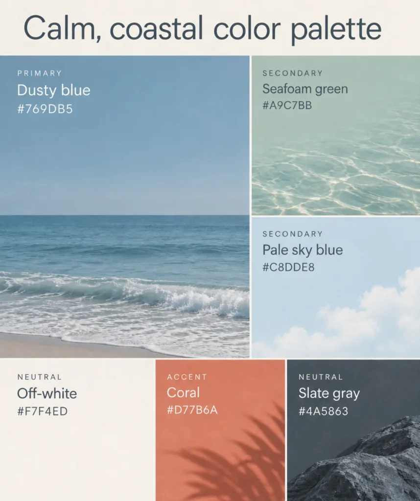
Primary: Dusty blue #769DB5
Secondary: Seafoam green #A9C7BB and pale sky blue #C8DDE8
Accent: Coral #D77B6A
Neutrals: Off-white #F7F4ED and slate gray #4A5863
Natural, grounded color palette
Inspired by natural materials and landscapes, this palette combines earthy, moderately muted colors to create a warm, grounded feel. The terracotta and golden ochre are analogous colors that create a warm, harmonious combination, while olive green adds variety without disrupting the natural aesthetic. Deep teal provides a cooler, near-complementary contrast to the terracotta. Using the oatmeal for backgrounds and small amounts of the dark brown will allow the richer colors to stand out without overwhelming the design.

Primary: Olive green #64734E
Secondary: Terracotta #BC7455 and golden ochre #CCA056
Accent: Deep teal #287C82
Neutrals: Oatmeal #F0E6D5 and dark brown #3B322B
Bright, playful color palette
This palette uses highly saturated colors and strong hue contrasts to create an energetic, playful effect. The electric blue and tangerine sit on nearly opposite sides of the color wheel, producing a striking contrast, while the hot pink adds further hue contrast from another part of the wheel. The bright yellow is located close to tangerine on the wheel, making them analogous colors, while its position almost opposite electric blue creates further contrast. Using the off-white as a background color and the near-black for text or other details will keep the design from becoming visually overwhelming.
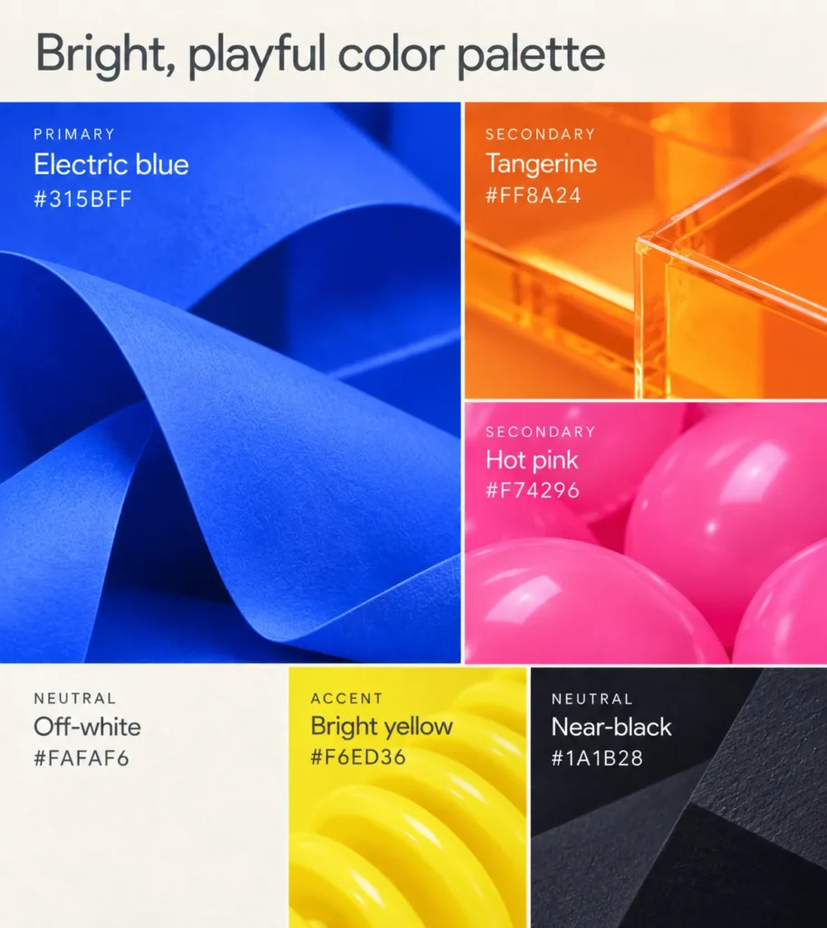
Primary: Electric blue #315BFF
Secondary: Tangerine #FF8A24 and hot pink #F74296
Accent: Bright yellow #F6ED36
Neutrals: Off-white #FAFAF6 and near-black #1A1B28
Rich, elegant color palette
The deep plum and dusty rose in this palette occupy relatively close positions on the color wheel, creating a sense of harmony, while the forest green provides a contrasting hue. Although the dusty rose and forest green are approximately complementary on the color wheel, their muted saturation softens the contrast between them. The antique gold introduces a warmer, brighter accent that can suggest luxury, particularly when used with a metallic finish. Large areas of the deep plum or the charcoal can create a dramatic effect, while prominent use of the warm ivory white will produce a lighter, more understated look.
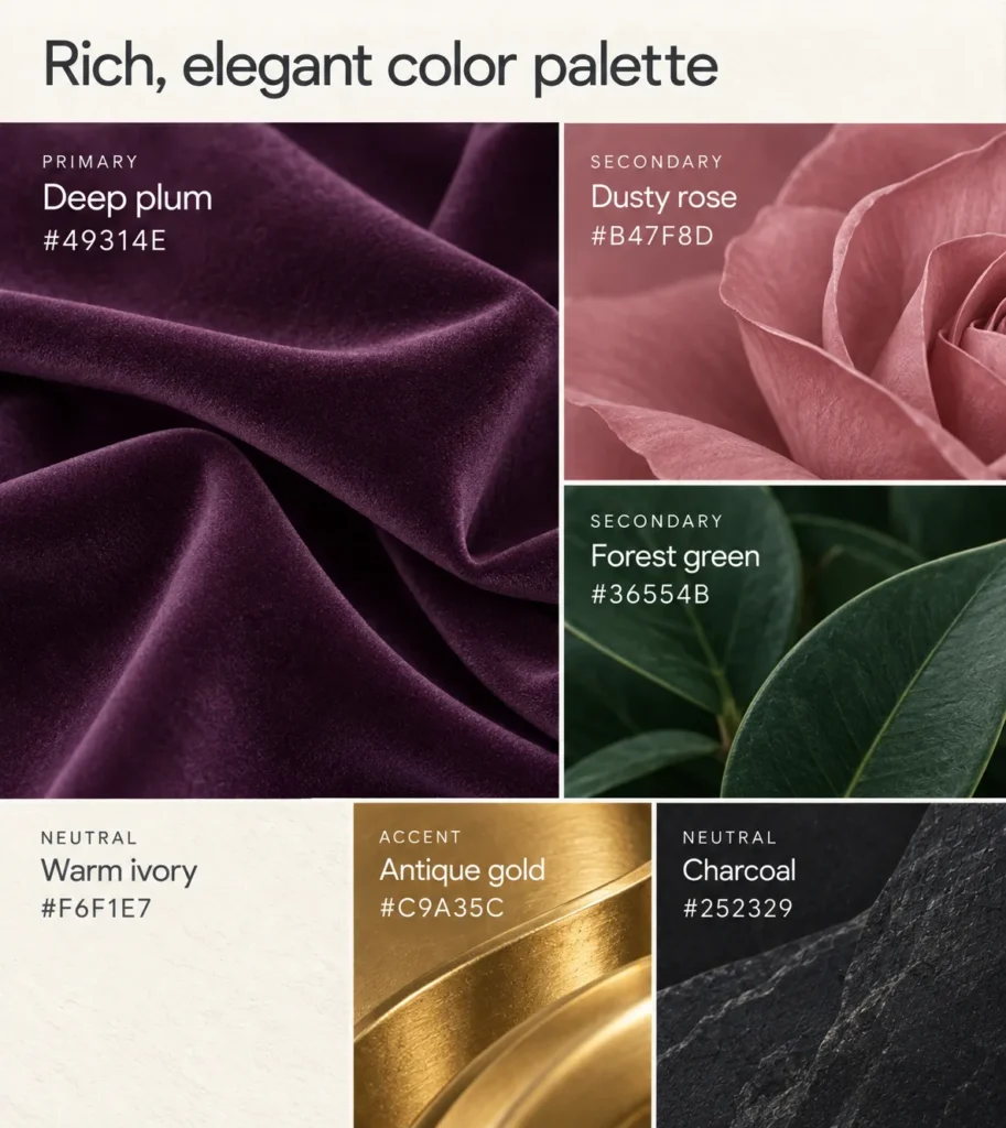
Primary: Deep plum #49314E
Secondary: Dusty rose #B47F8D and forest green #36554B
Accent: Antique gold #C9A35C
Neutrals: Warm ivory #F6F1E7 and charcoal #252329
Soft, romantic color palette
This palette combines light, soft colors to create a delicate, romantic atmosphere. The blush pink and raspberry are neighboring hues on the color wheel, creating a harmonious combination, while the deeper raspberry provides contrast in lightness and color intensity. Lavender and powder blue introduce cooler hues that create gentle color variation without overwhelming the pastel palette. Using the lighter colors against pearl white and reserving raspberry for accents helps maintain a soft, cohesive appearance.
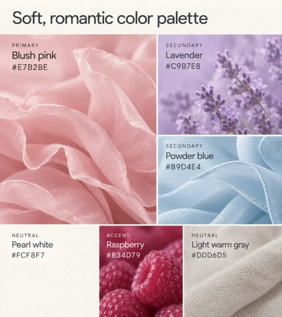
Primary: Blush pink #E7B2BE
Secondary: Lavender #C9B7E8 and powder blue #B9D4E4
Accent: Raspberry #B34D79
Neutrals: Pearl white #FCF8F7 and light warm gray #DDD6D5
Crisp, contemporary color palette
This palette combines a restrained neutral foundation with cool blues and a striking lime green accent. The cobalt blue and muted slate blue sit close together on the color wheel, creating an analogous combination, while their different levels of saturation add visual variety. The lime green introduces strong hue contrast, sitting roughly opposite the blues on the color wheel. A design with prominent use of the soft white and pale gray will feel cleaner and lighter, while greater use of the charcoal will produce a bolder, more dramatic effect.
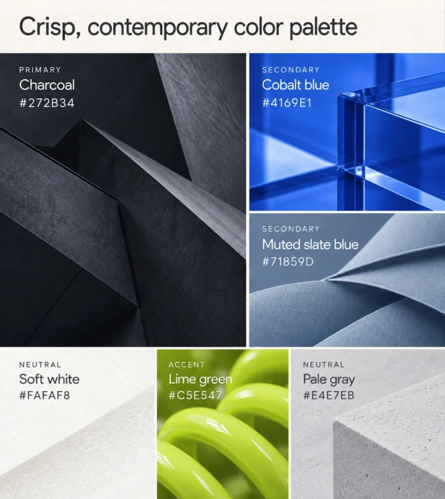
Primary: Charcoal #272B34
Secondary: Cobalt blue #4169E1 and muted slate blue #71859D
Accent: Lime green #C5E547
Neutrals: Soft white #FAFAF8 and pale gray #E4E7EB
Frequently asked questions about color palettes
- What are the characteristics of good color palettes?
-
Good color palettes bring together colors that work well visually, convey an appropriate mood or style, and serve clear purposes within a design.
The most effective color palette for a project depends on its purpose, audience, and the visual impression you want to create. These are some of the factors to consider:
- Visual harmony: Colors that complement one another or create intentional contrasts
- Cohesive mood or style: Colors that work together to convey a consistent mood, aesthetic, or brand personality
- Effective contrast: Sufficient differences in hue, lightness, or saturation to create visual interest, distinguish elements, and support readability
- Clear color roles: A balance of dominant, secondary, accent, and neutral colors, each serving a particular purpose
- Thoughtful proportions: Colors used in proportions that establish visual balance and direct attention to important elements
You can use the colors in an image you like to help you create a palette for your project. Upload it to Quillbot’s free Color Palette Generator to identify the color codes.
Other interesting articles
If you want to know more about colors, letters, or the meaning of emojis, make sure to check out some of our other articles with explanations and examples.